

Laboratorios Camacho
Screen printed in Los Angeles using Pantone 355 ink (front) on Champion 7 oz cotton t-shirt with embroidered mark on sleeve. Inspired by vernacular graphics documented while walking and riding public transportation throughout the city — the namesake signage was found on an industrial strip in North Los Angeles.
All Fonts Are Bastards
Organized a lecture with Index, Dinamo: All Fonts Are Bastards (2022), at Other Means, New York. Johannes Breyer presented the studio and the ups and downs of navigating the independent type foundry game. Project realized with Dinamo, Johannes Breyer, Fabian Harb, Index, Elie Andersen, Other Means, Gary Fogelson, Phil Lubliner, and Ryan Waller.
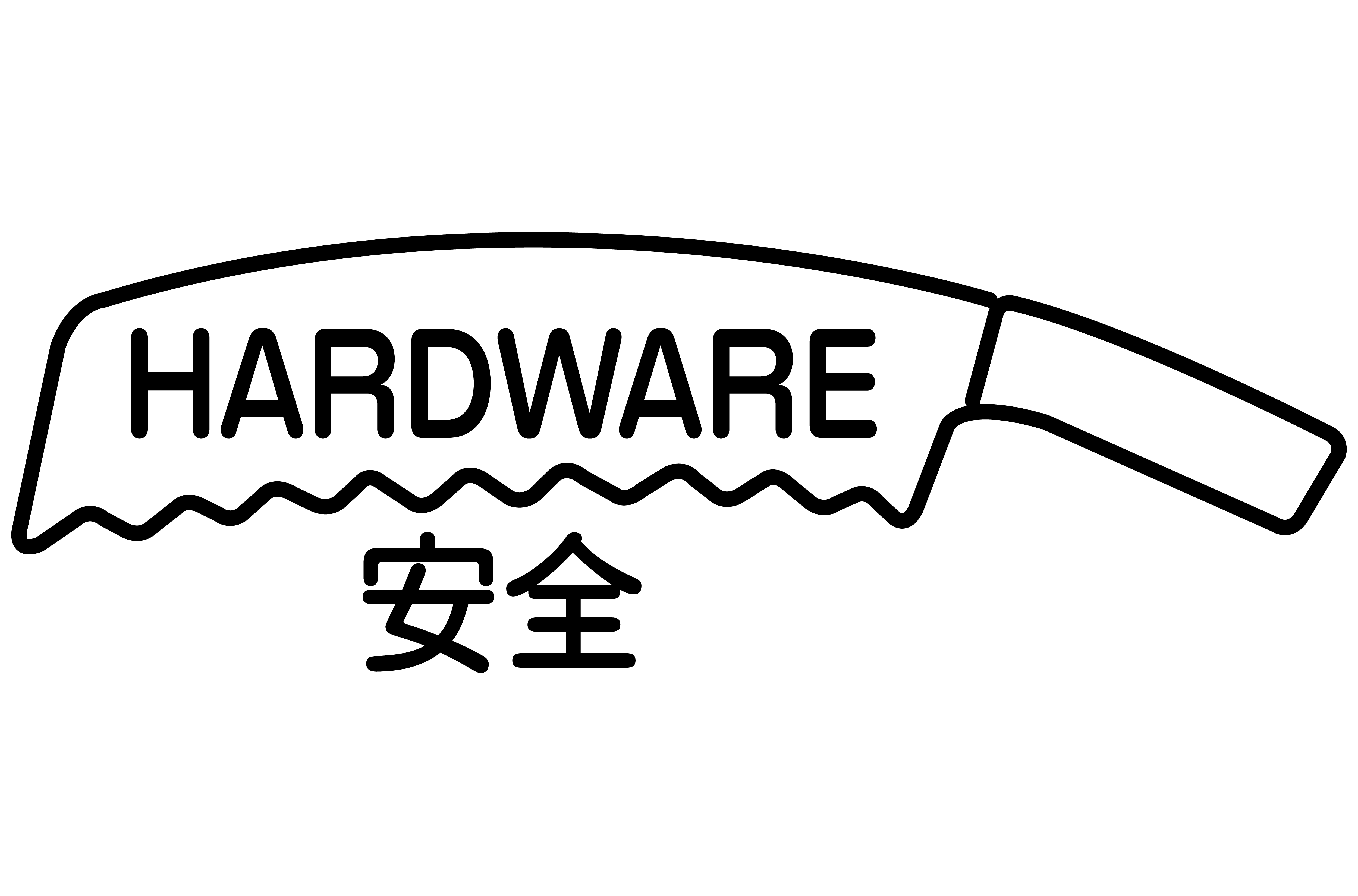
Anzen Hardware
Screen printed in Los Angeles using black ink (front) on Gildan Ultra Cotton t-shirt. Typeset in Source Type Karl. Inspired by neon signage found inside the namesake store, this project was initiated as a fundraiser for Anzen Hardware (Est.1946) which closed their location at 309 East First Street in late September 2023. Anzen will be opening again in December at another location in Little Tokyo under new ownership. In collaboration with Dorian Nagy and Anzen Hardware.
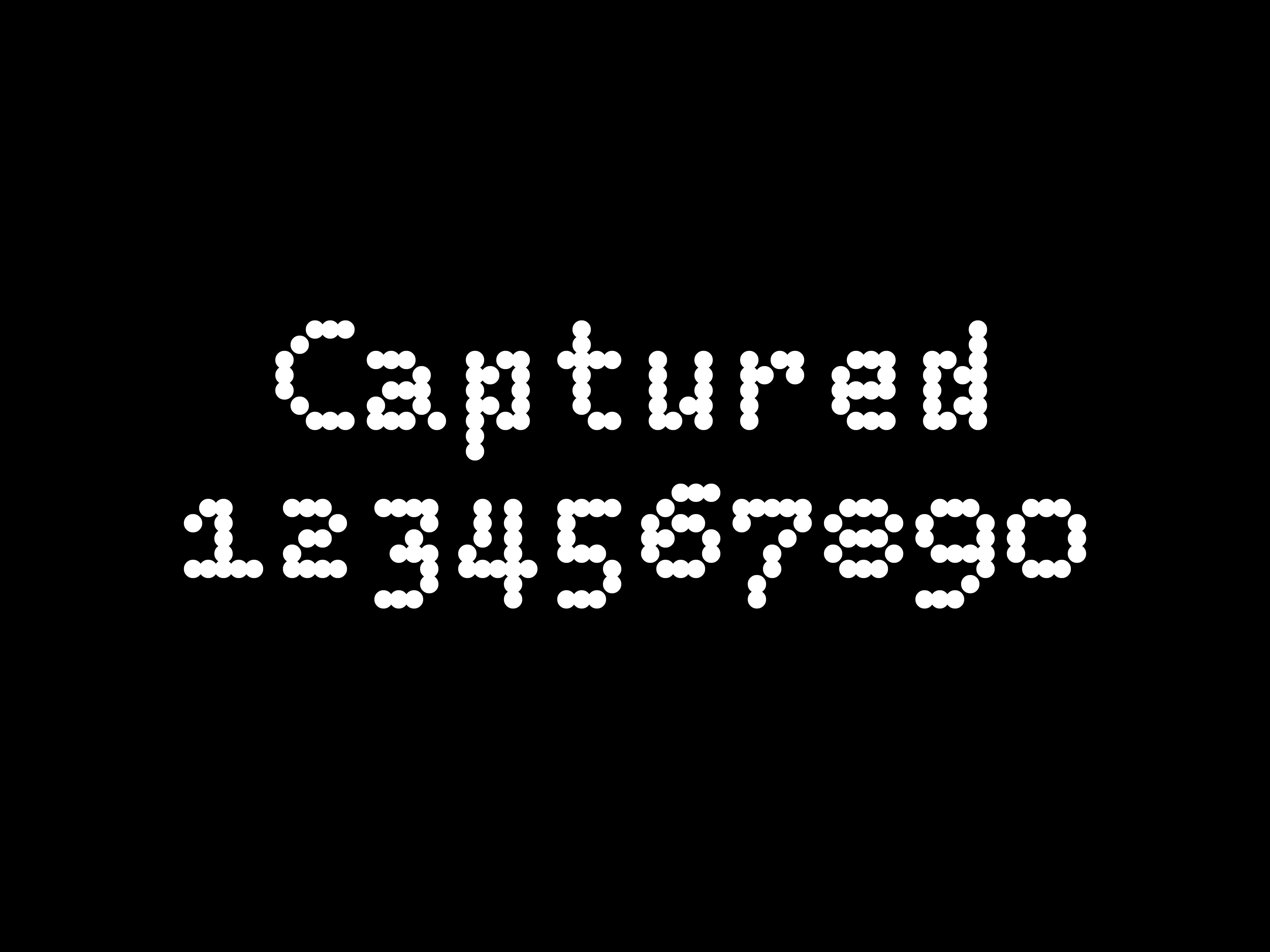
Captured
Captured is a variable weight, fixed-width typeface inspired by credit card capture technology, developed in 1960 by IBM, and its introduction as a gateway to an interminable digital reality. Captured has 234 glyphs with basic Latin characters, lining figures, old style figures, ligatures, punctuation, symbols, and extensive alternates. License includes 5 styles. Available at Primary. Nike Football campaign by Forth+Back.
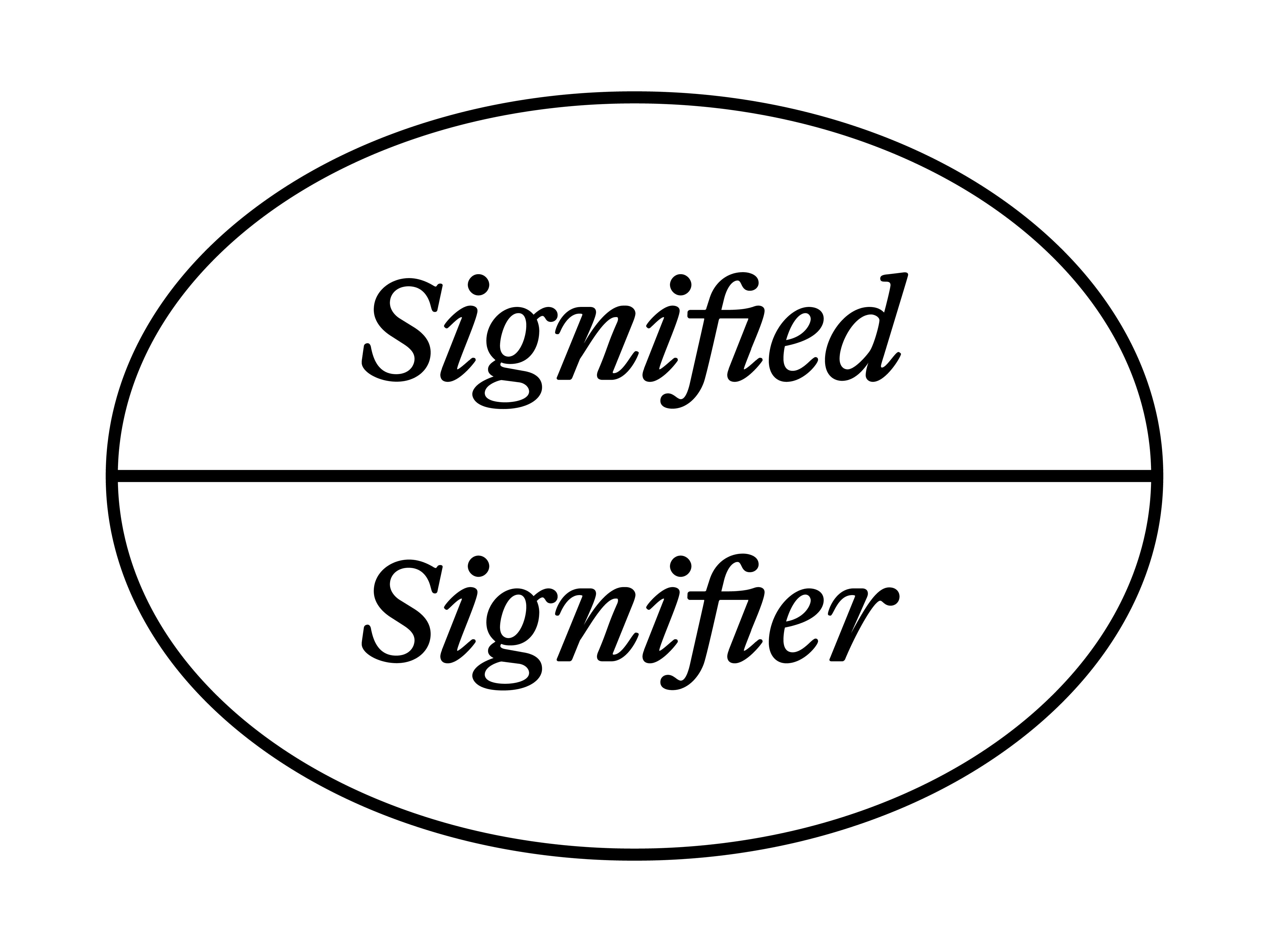
Signifier
Screen printed in Los Angeles using black ink (front) on Gildan Ultra Cotton long sleeve t-shirt with TAGBANGER demask woven label hand stitched inside. Typeset in Dinamo Janson Max. In semiotics, signified and signifier stand for the two main components of a sign, where signified pertains to the ‘plane of content,’ while signifier is the ‘plane of expression.’ The idea was first proposed in the work of Swiss linguist Ferdinand de Saussure, one of the two founders of semiotics. The postmodernist social theorist Jean Baudrillard spoke of hyperreality, referring to a copy becoming more real than reality — in other words, how the signifier becomes more important than the signified.
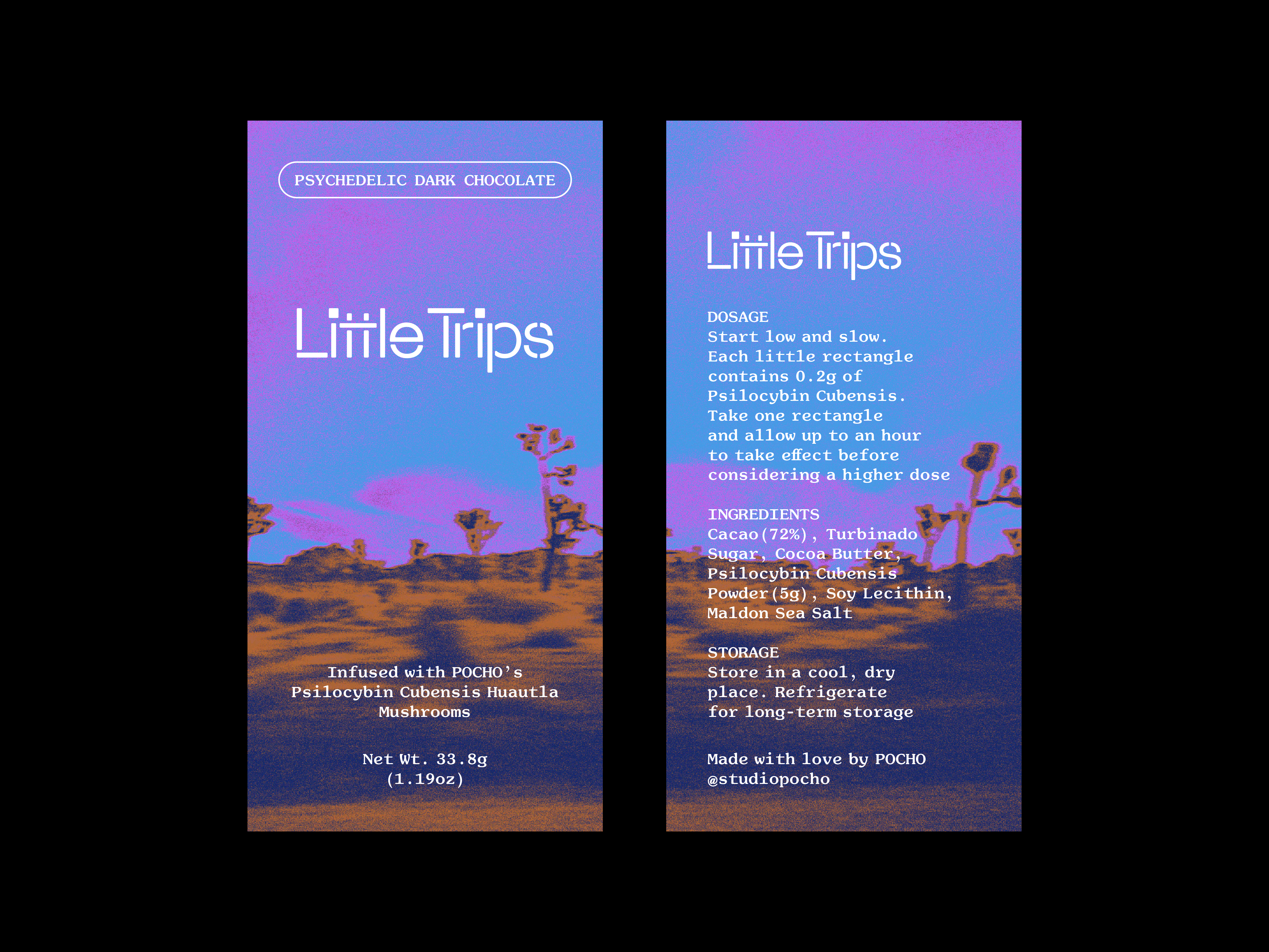
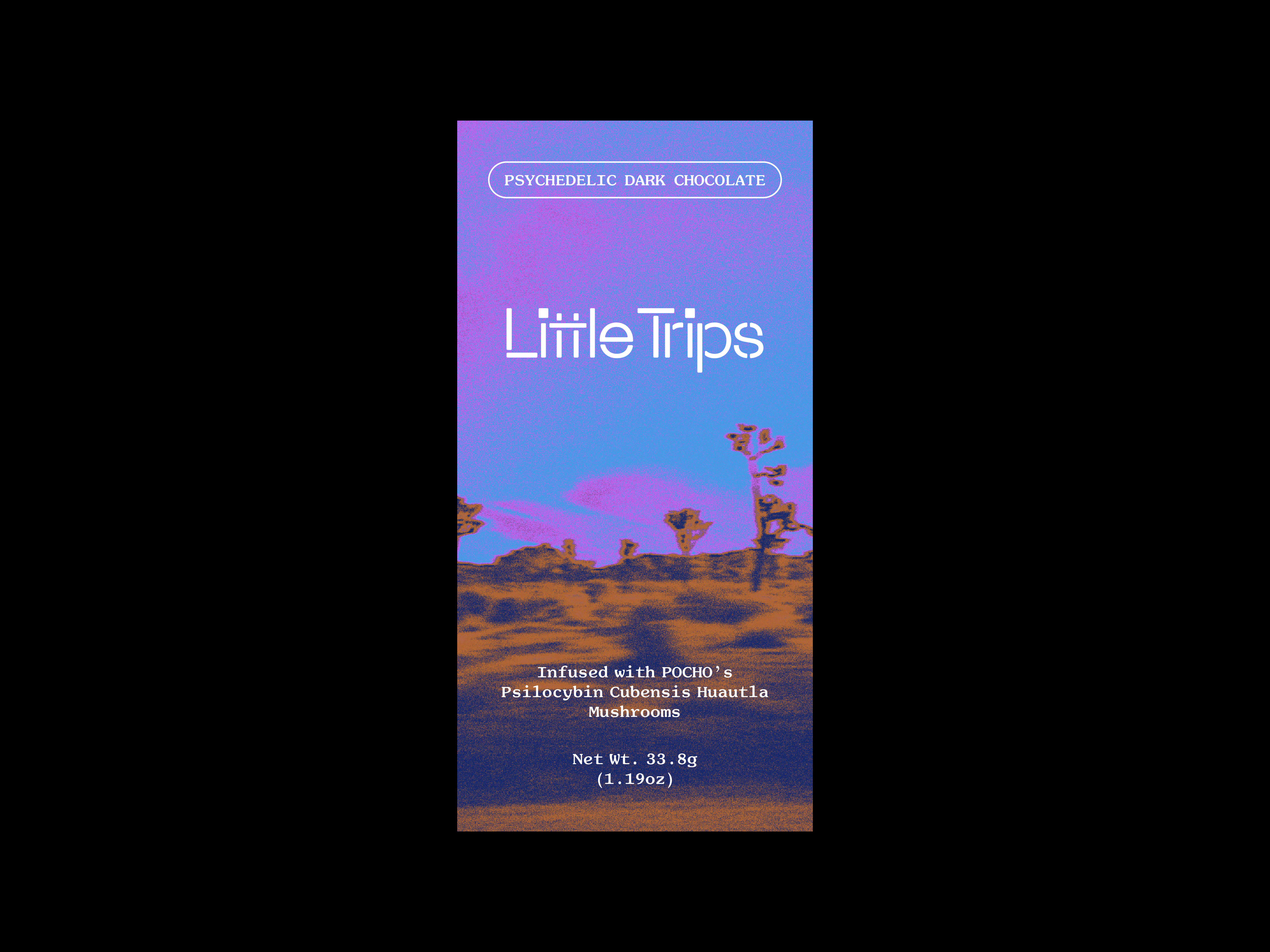
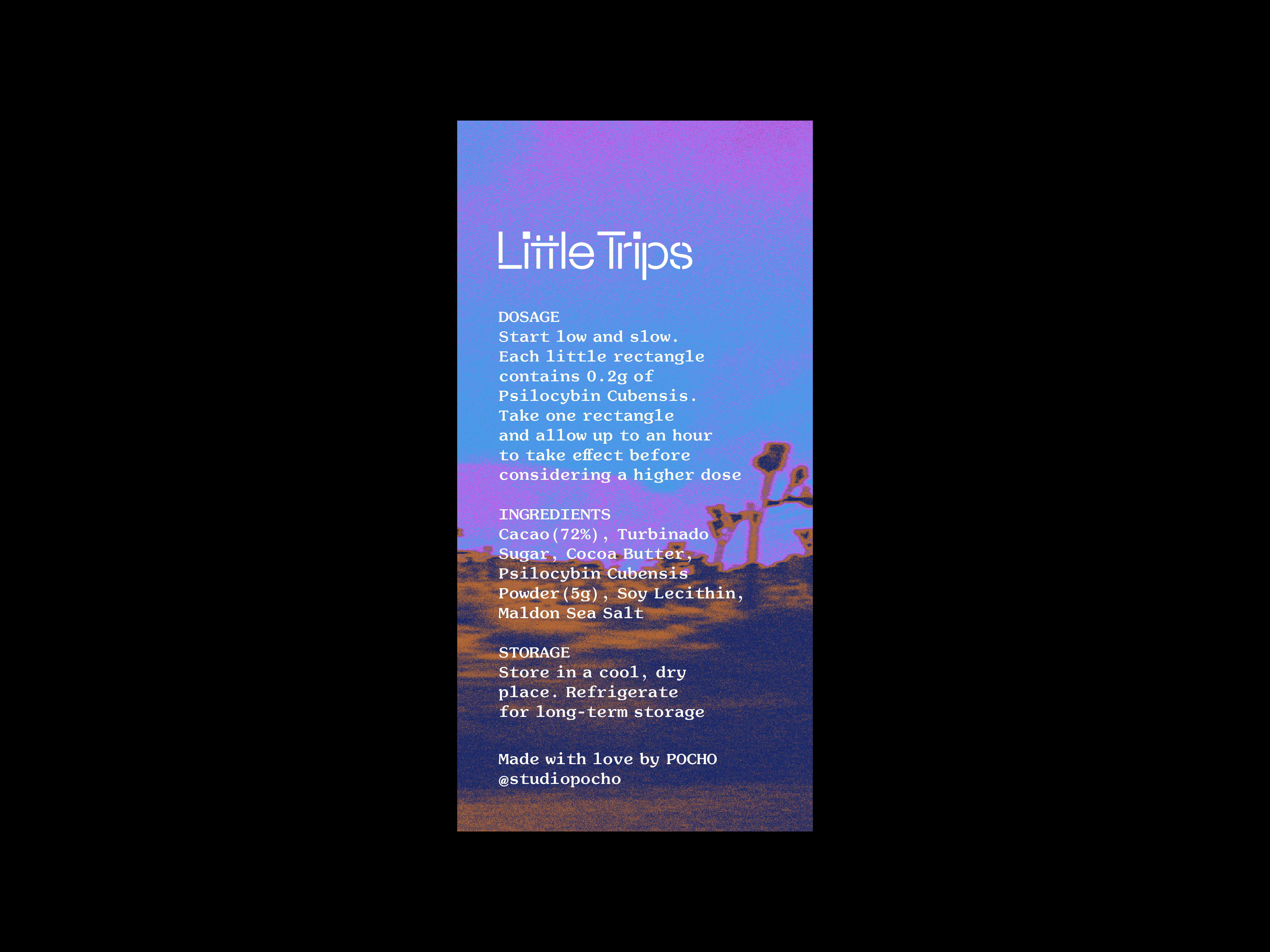
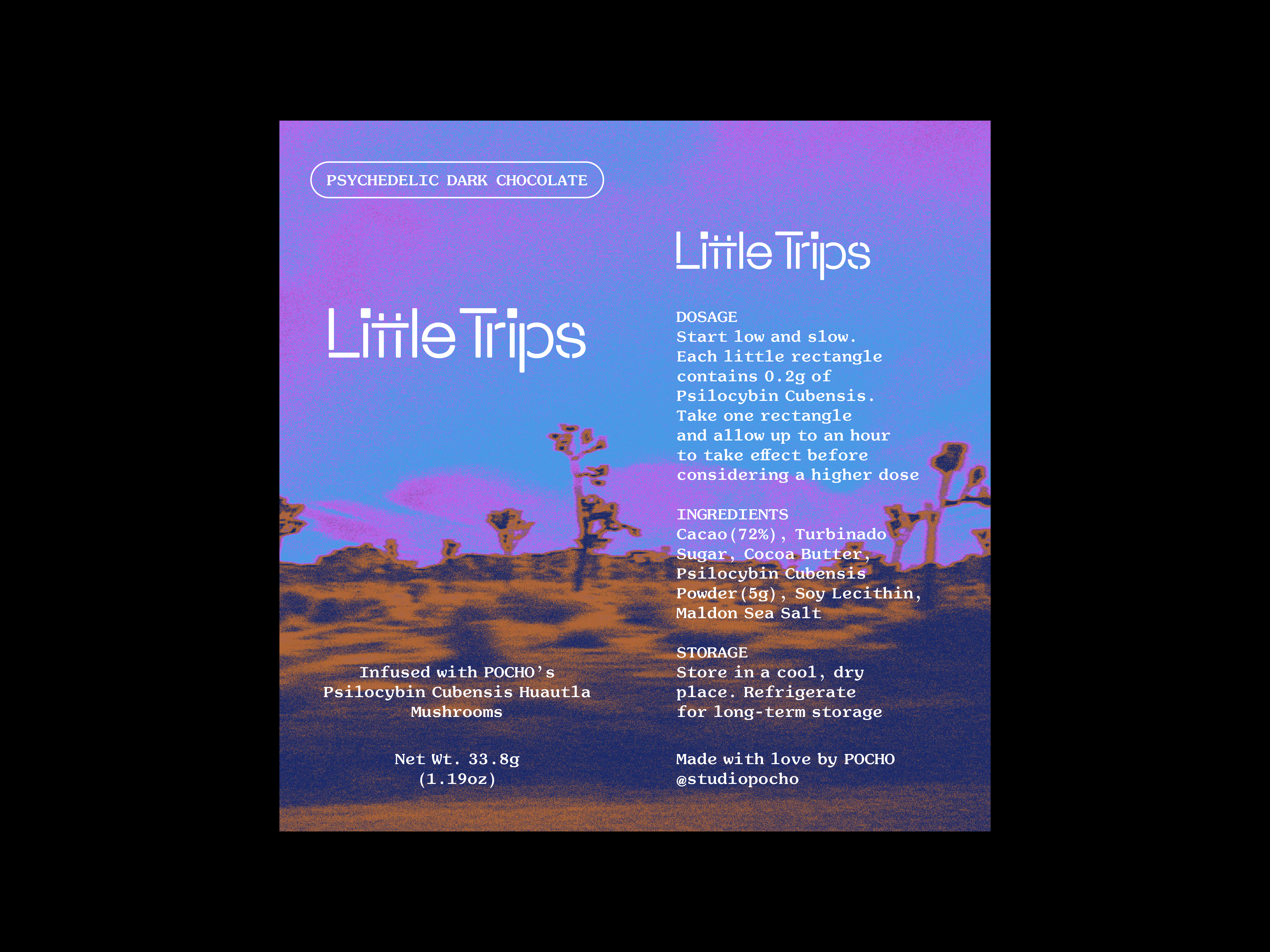
Studio Pocho
Design, typography, with art direction by Esai Ramirez, and exploration of identity for Studio Pocho. Little Trips balances the aesthetics of both formal and vernacular graphic design for the exploratory phase of a line of psilocybin-infused chocolate. The phase also served as a warmup for the forthcoming Studio Pocho food pop-up identity, which takes a deep dive into the culinary delights of Oaxaca, Mexico. Maxéville Constructed typeface by Mark Niemeijer.
Kick Over The Statues
Organized a lecture, Michael Worthington: Kick Over The Statues (2022), with Index, New York. Worthington presented the exhibition Torn Apart: Punk, New Wave + the Graphic Aftermath, 1976–86, highlighting a selection of ephemera from the show including posters, clothing, flyers, and zines, with a focus on graphic design and typography. Project realized with Michael Worthington, David Karwan, Index, and Elie Andersen.
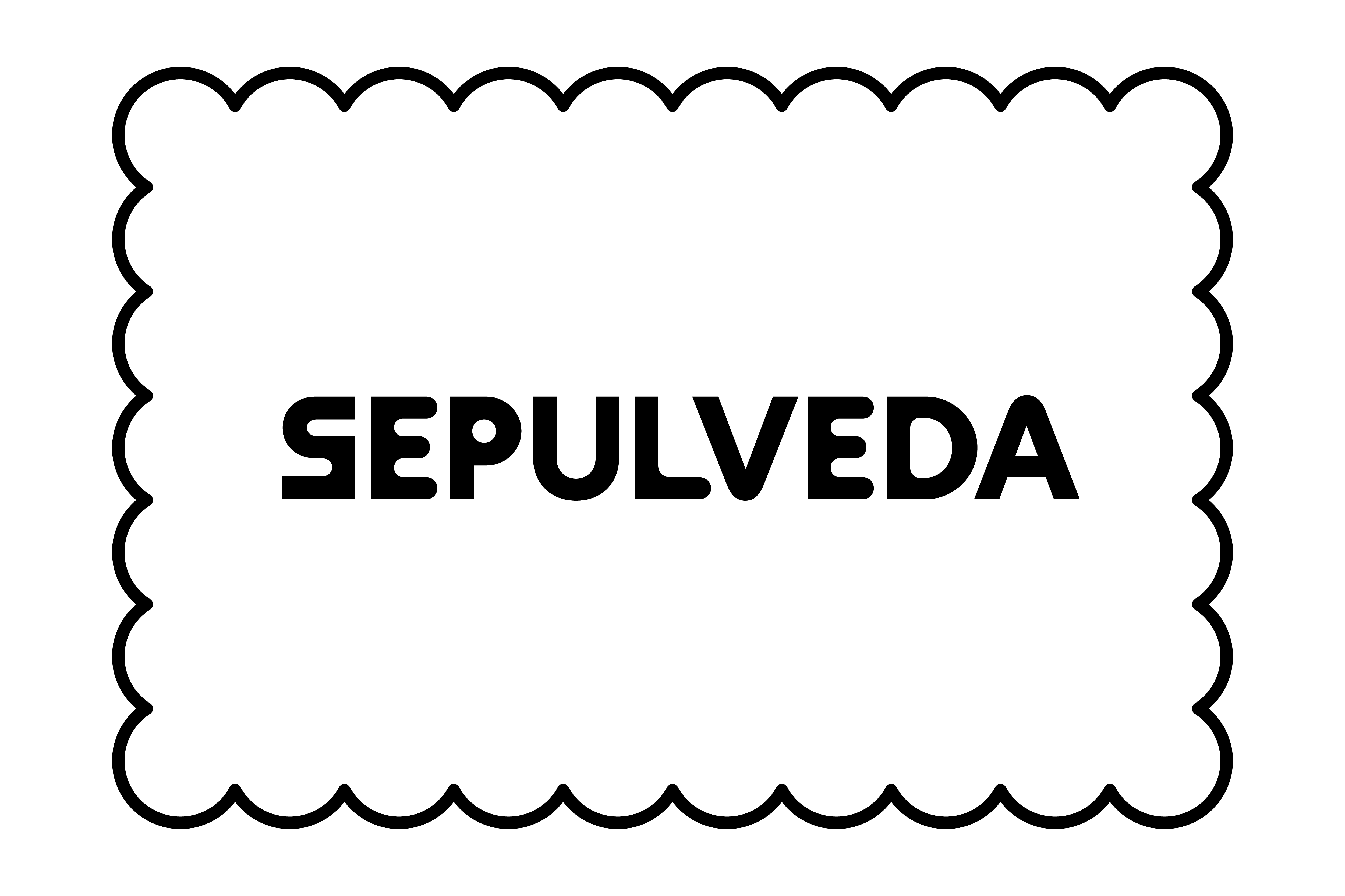
Sepulveda
Design and art direction of identity for Sepulveda. A Boulevard, the longest in Los Angeles, Sepulveda is reimagined as a fictional counterpart to Pico House which is located across from Plaza de Los Ángeles and was built with proceeds from the sale of Governor Pio Pico’s vast land holdings in the San Fernando Valley. It takes inspiration from a prospective digestive biscuit that might be found in a South Asian grocery store. Typeset in Dinamo Maxi. In collaboration with Tona Lagos.
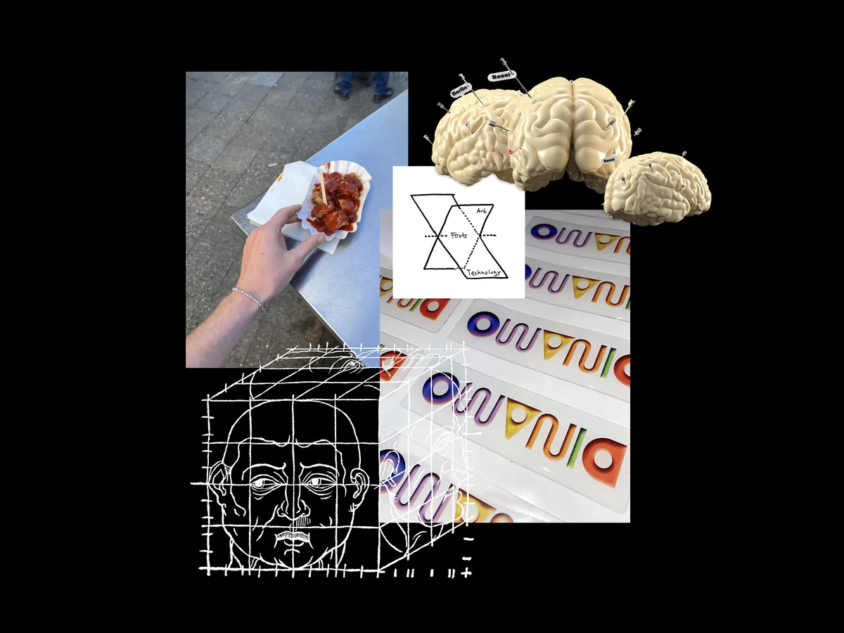
Los Angeles (Annexed)
In December 2019, I walked the entire length of Crenshaw Boulevard — 26 miles — from Wilshire and Crenshaw, a few blocks from my Middle School (John Burroughs), to San Pedro, where I watched the sunset into the Pacific Ocean at Sunken City.¹ A friend I met there took me to her bar in San Pedro, where I had a beer and a few tamales while we talked. I was, understandably, very tired. My feet ached, and the second leg, 13 miles, of my walk along Crenshaw was at times both lonely and desolate. Afterwards, I walked across the street from the bar to take the Metro Silver Line back to Wilshire… Read More†
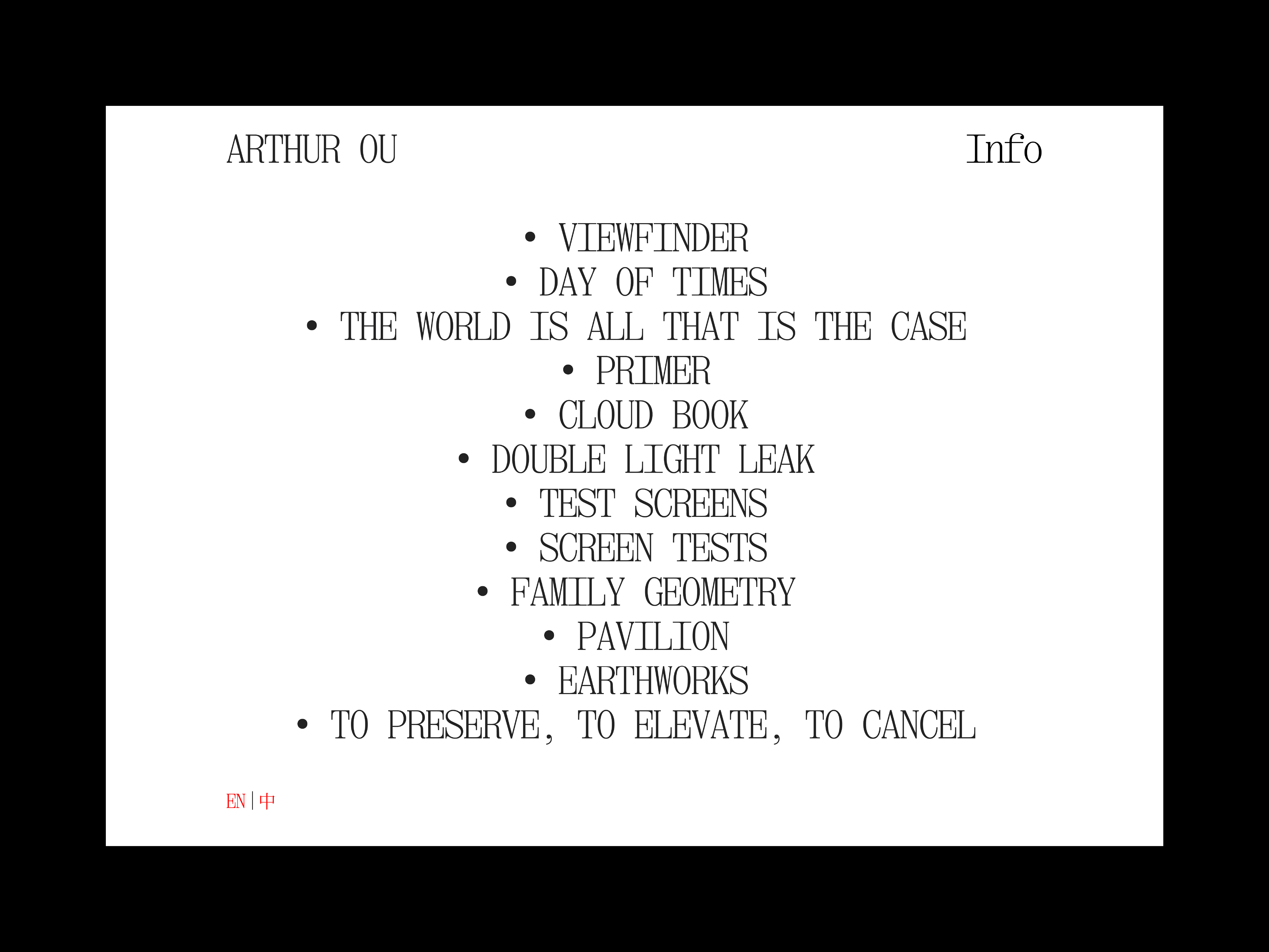
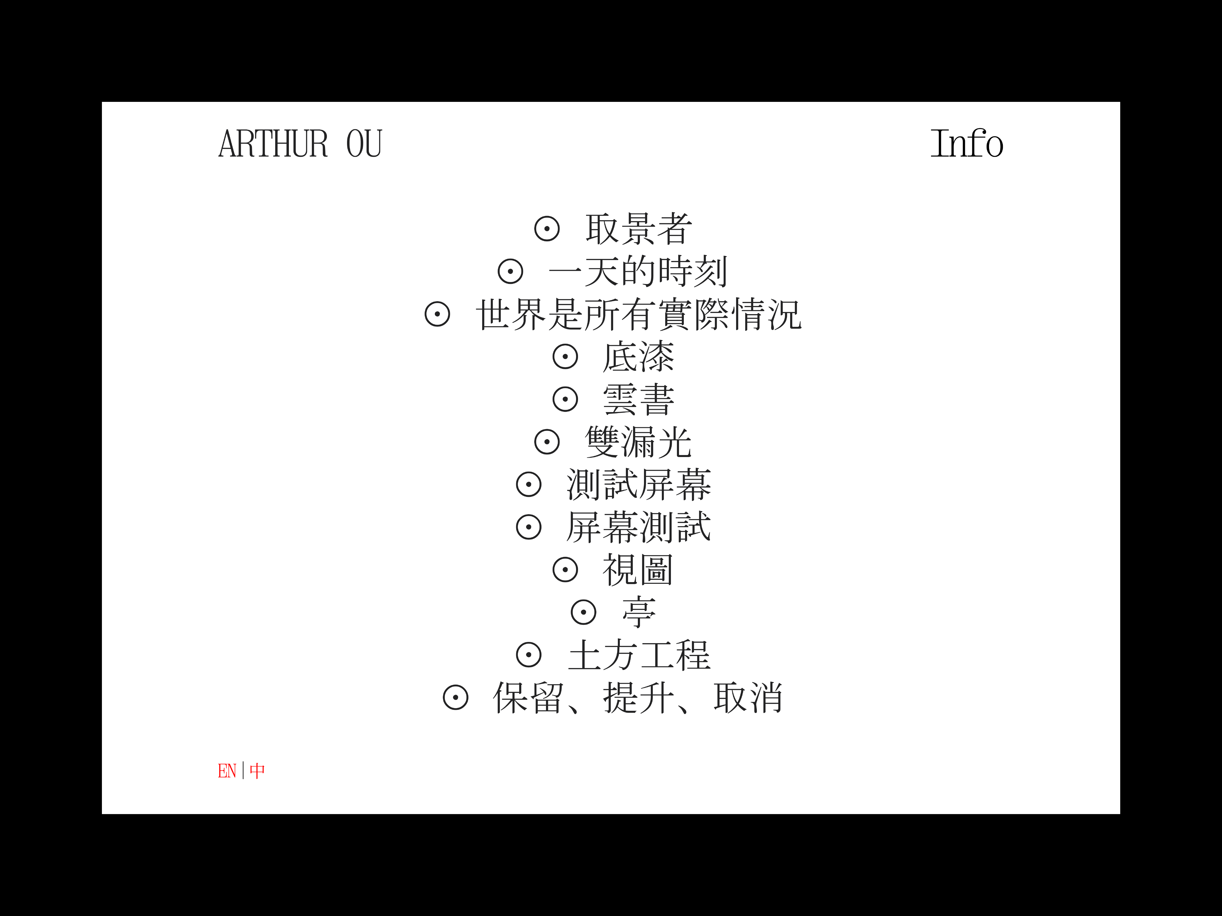
Arthur Ou
Design, art direction, and development of site for Arthur Ou. The project was a collaborative effort with New York-based artist Arthur Ou, Berton Hasebe, and Grant Hao-Wei Lin, to develop a multilingual site with all content in both Latin and Chinese script. Extra Mono typeface by Berton Hasebe.
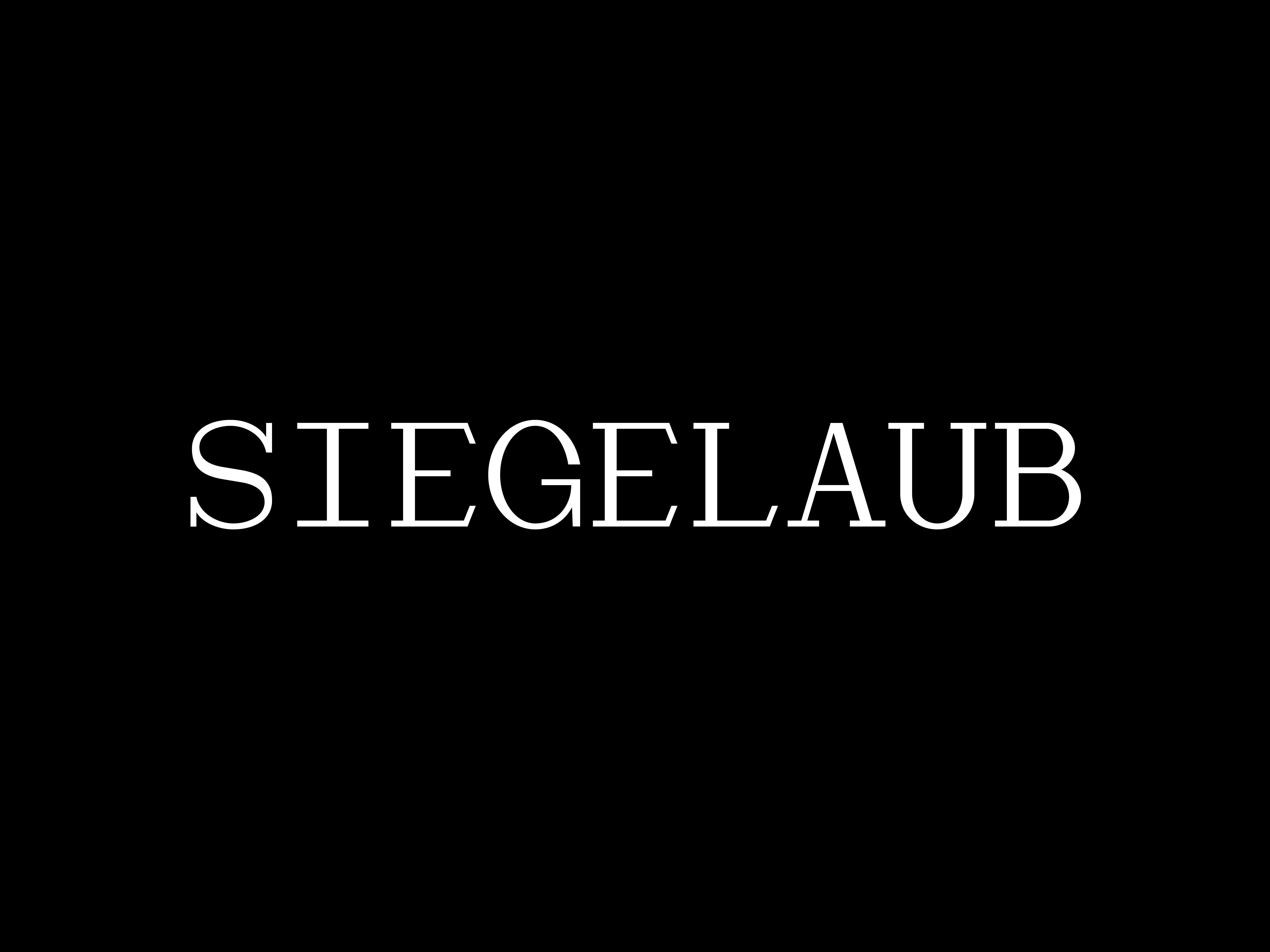
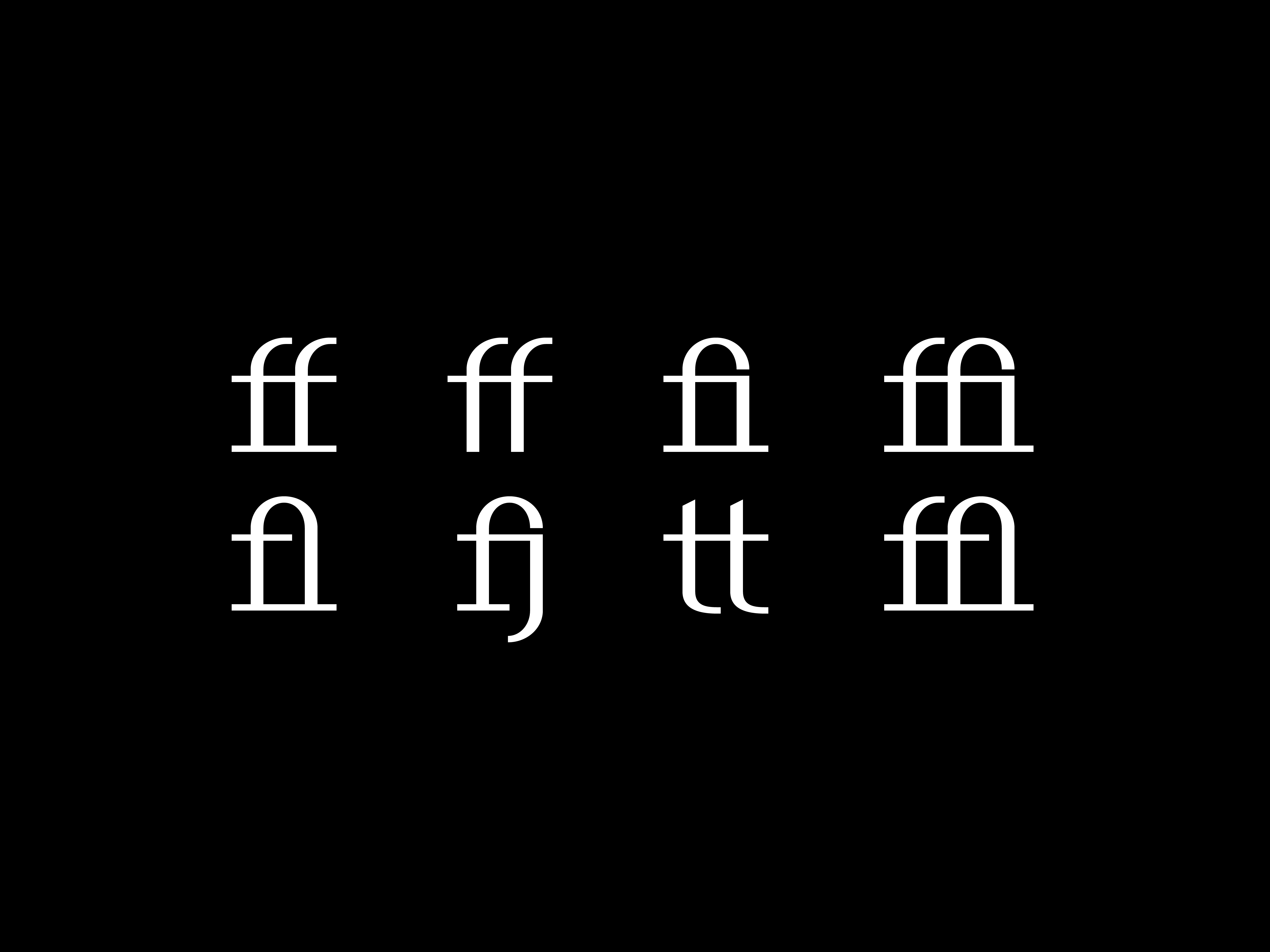
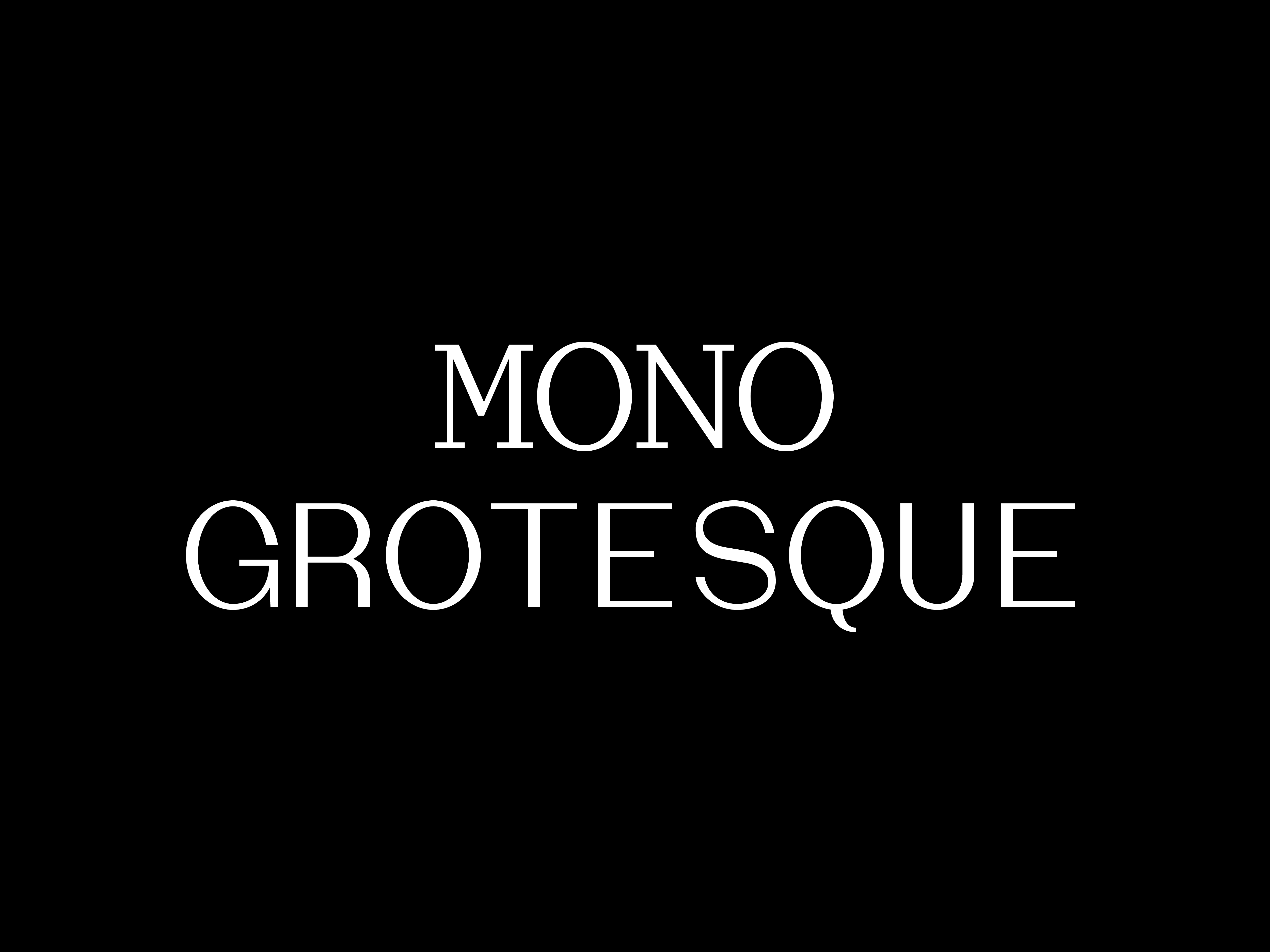
Siegelaub
Design of Siegelaub, a fixed-width typeface inspired by the work of curator Seth Siegelaub, author of The Artist’s Reserved Rights Transfer and Sale Agreement (1971), and (unidentified) type, documented in a vitrine at the Hollywood YMCA, being used to caption images of amateur athletes from the 1970s. Siegelaub has 128 glyphs with basic Latin characters, lining figures, alternates, ligatures, punctuation, and symbols. License includes two styles, Mono and Grotesque. Available at Primary.
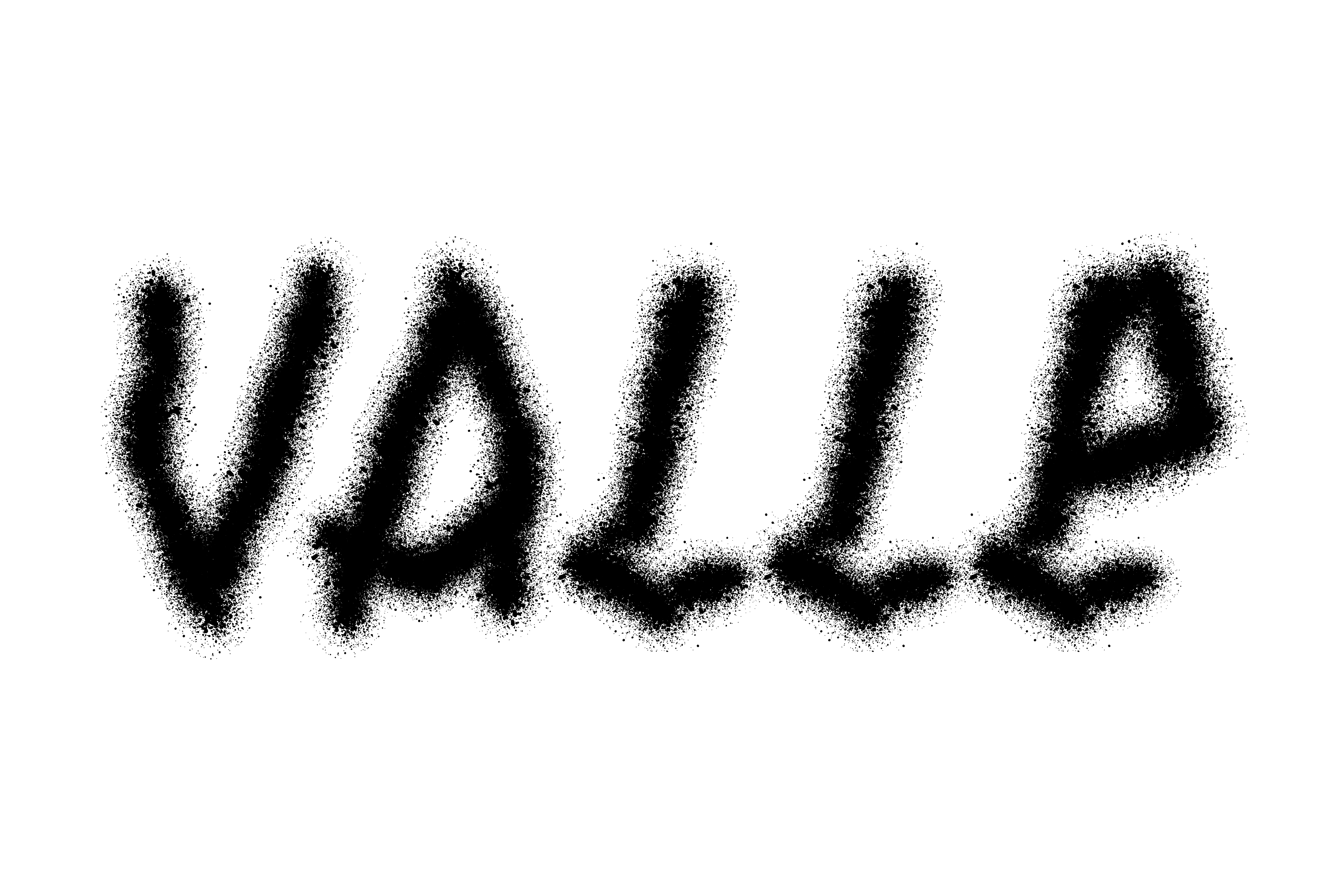
Valle (Annexed)
Screen printed in Los Angeles on 70s deadstock t-shirts with TAGBANGER demask woven label hand stitched inside. Los Angeles (Annexed) is an ongoing series of outputs which explore the impact of the 321 annexations which make up the City of Los Angeles. Valle (Annexed) is a bootleg of the 1976 Joey Terrill ‘Malflora/Maricón (Rolemodel)’ t-shirt and, similarly, subverts language that is typically used to diminish people living in the San Fernando Valley, which was annexed by the City of Los Angeles in 1915.
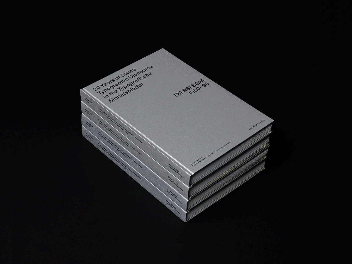
TM Research Archive
Organized a lecture, Louise Paradis: Typografische Monatsblätter Research Archive (2022), with Index, New York. Paradis presented their work on 30 Years of Swiss Typographic Discourse in the Typografische Monatsblätter. Project realized with Louise Paradis, Index, and Elie Andersen.
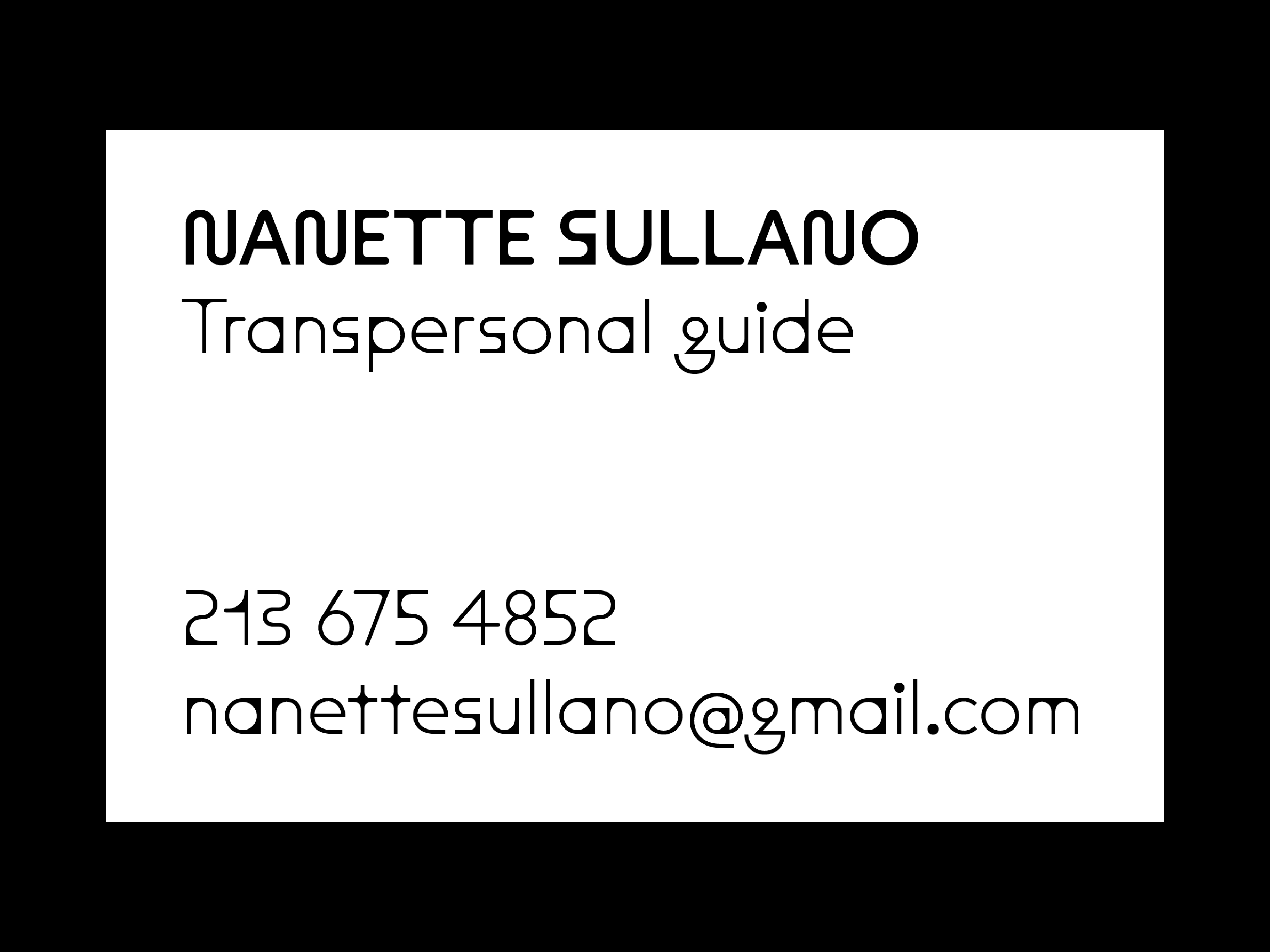
Nanette Sullano
Design and art direction of business card and identity for Nanette Sullano. Typeset in Dinamo Maxi Round. Sullano is a transpersonal guide and facilitator, working with people to offer healing through sacred plant medicines, nonviolent communication, and other types of transformative work.
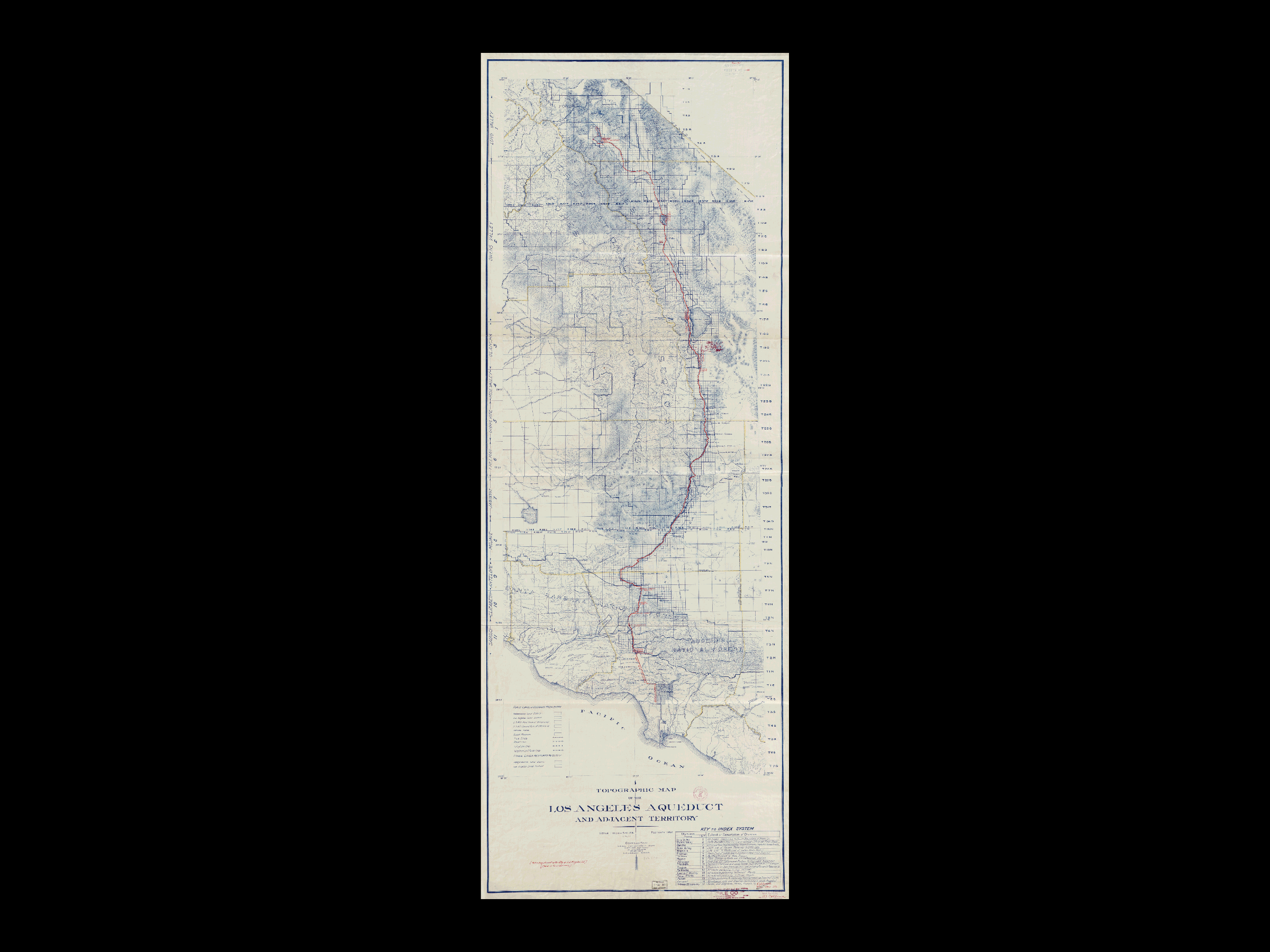
Cultural Backwater
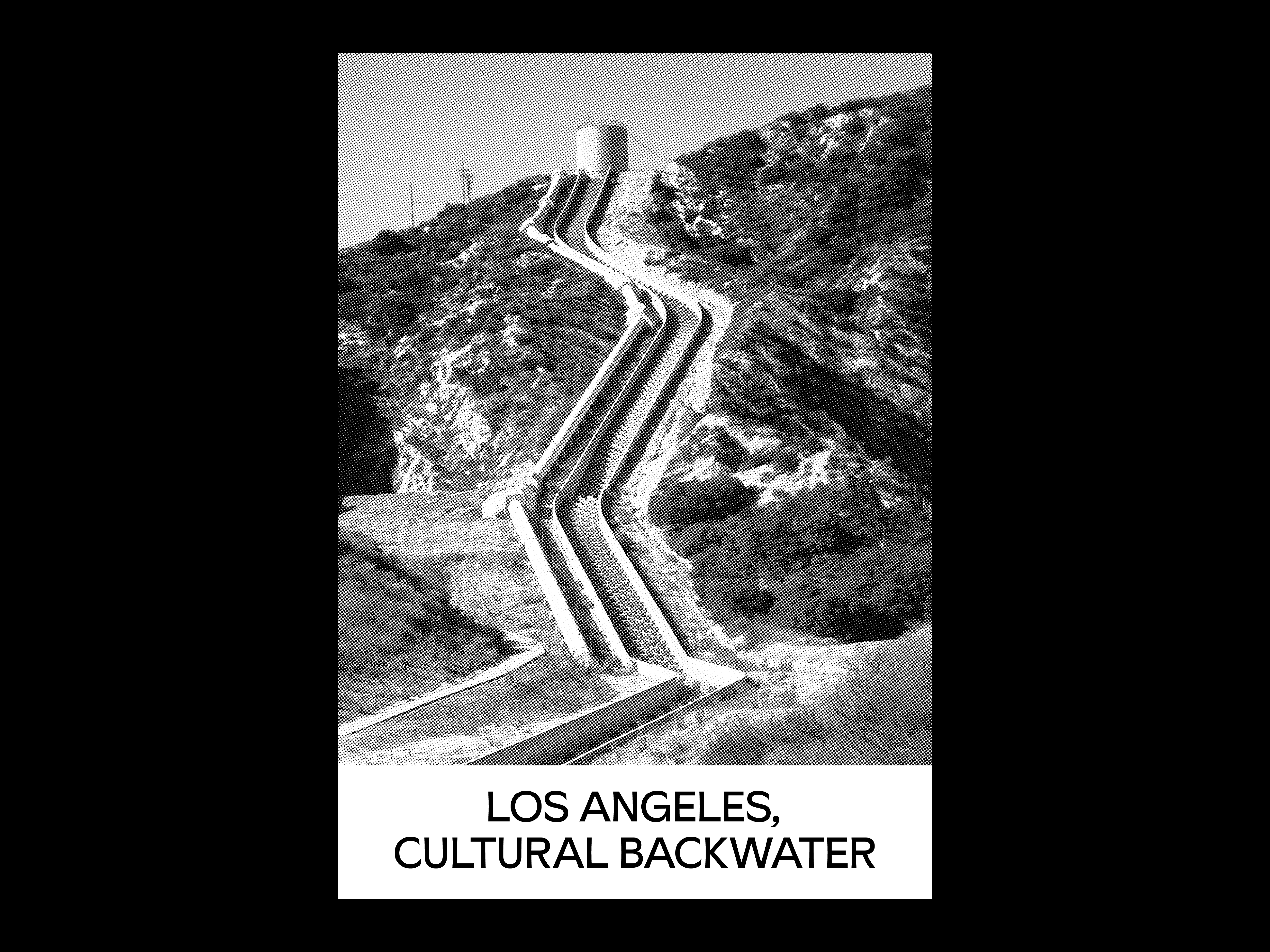
Screen printed in Los Angeles using black ink (front) on Gildan Ultra Cotton long sleeve t-shirt with TAGBANGER demask woven label hand stitched inside. Typeset in Sunset Gothic by Benjamin Critton. Los Angeles (Annexed) is an ongoing series of outputs which explore the impact of the 321 annexations which make up the City of Los Angeles. Los Angeles, Cultural Backwater makes the connection between annexation of specific sections in the region which gave the city access to water via the Los Angeles River, Arroyo Seco, and the Los Angeles Aqueduct which carries water from the Owens Valley to Los Angeles, entering the city at its most Northern point. Cultural Backwater is a reference to Reyner Banham’s texts on the city in Los Angeles: The Architecture of Four Ecologies; Los Angeles’ historical anxieties about how it is perceived by the rest of the world; and the literal movement of water from the mountains ranges behind the city, and the Owens Valley in the Sierra Nevada mountains, to reservoirs along the San Gabriel mountains, The Verdugos, and the Santa Monica mountains (Stone Canyon, Franklin Canyon, Hollywood, and Silver Lake reservoirs, et al.) — a complex network of infrastructure which literally engineered Los Angeles as we now know it into existence.
Adrian Piper
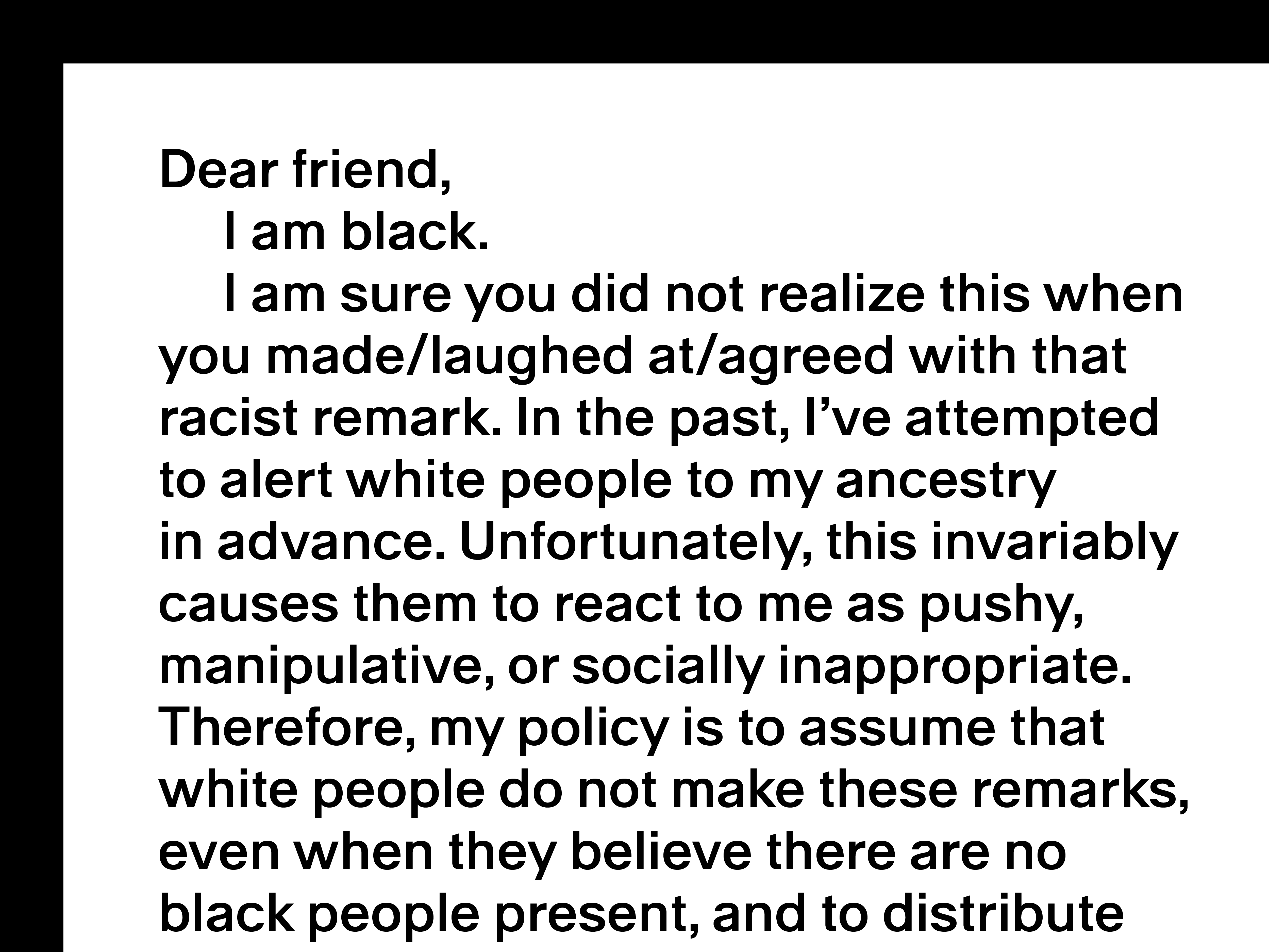
Screen printed in Los Angeles using black ink (front) on Gildan Ultra Cotton long sleeve t-shirt with TAGBANGER demask woven label hand stitched inside. Typeset in Dinamo Walter Alte. Adrian Piper is a bootleg of the 1986 work ‘My Calling (Card) #1’ by artist Adrian Piper. The bootleg edits the words ‘racial identity’ and replaces them with ‘ancestry’ in acknowledgement of the work of Barbara and Karen Fields (Racecraft, 2012).
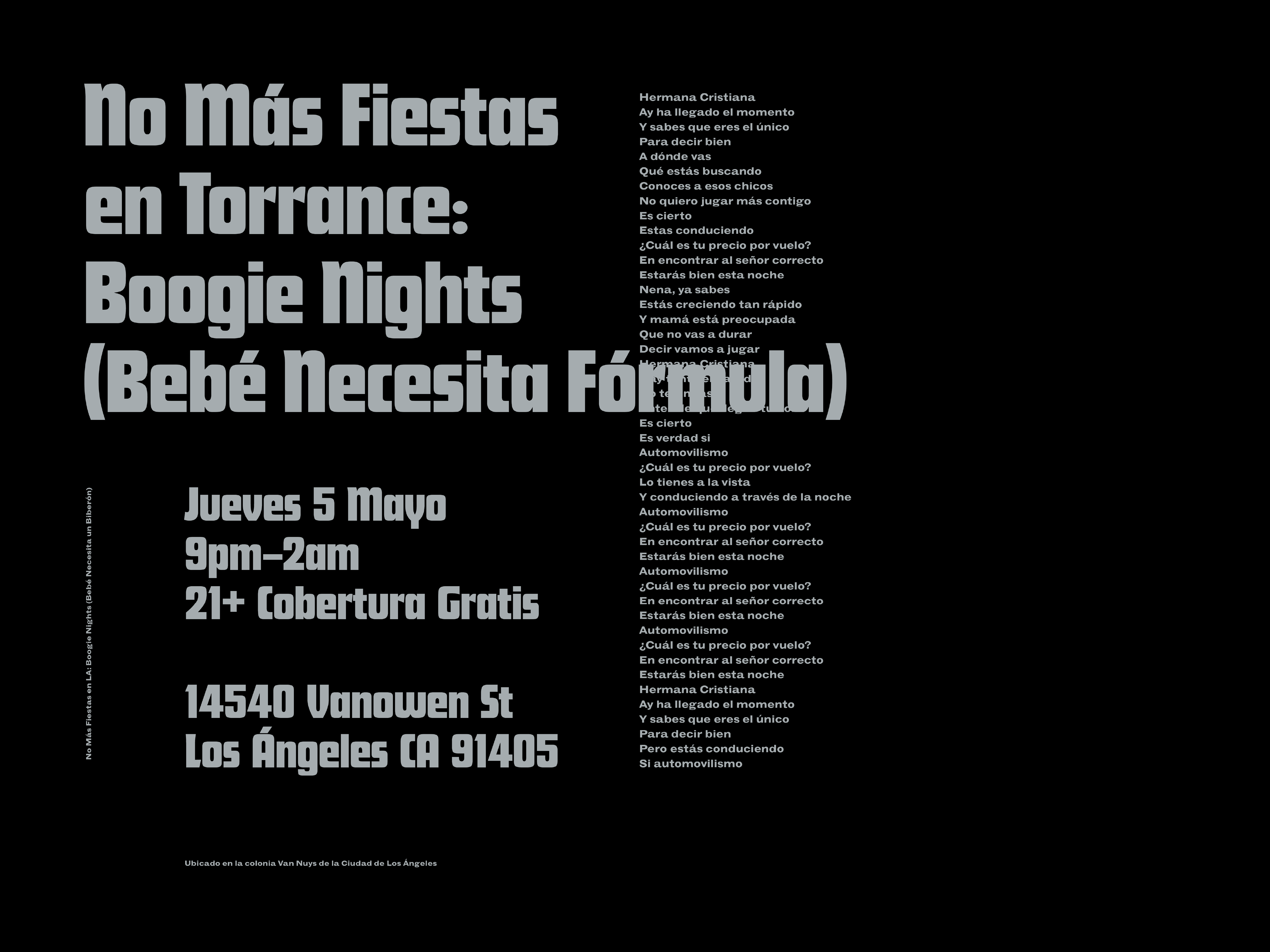
Baby Needs Formula
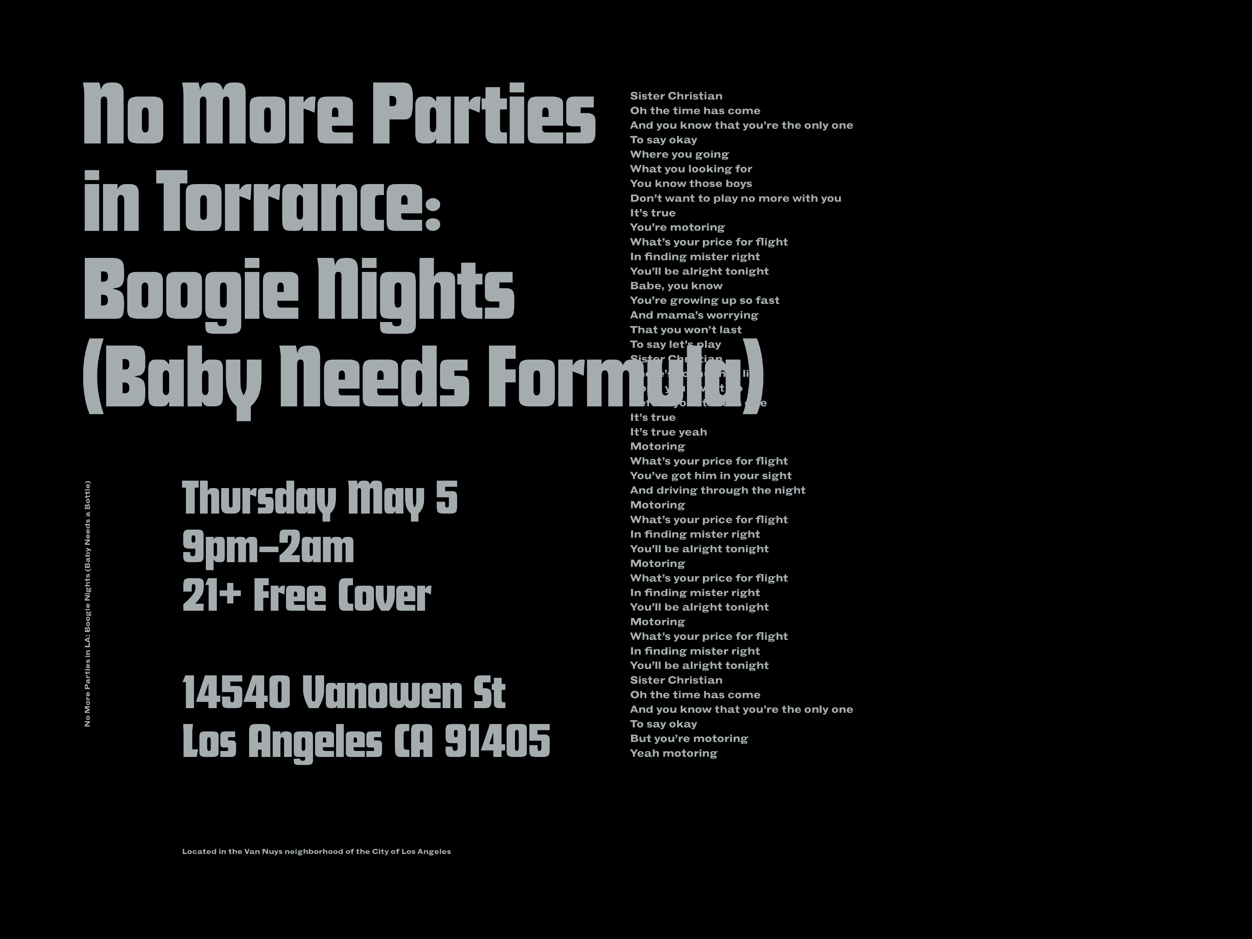
Design and art direction of posters (English and Spanish) for a party on May 5 that includes lyrics from the 1984 power ballad ‘Sister Christian’ which was used by Paul Thomas Anderson in Boogie Nights (1997) to capture the turmoil and dysfunction of North Los Angeles. No More Parties in Torrance.
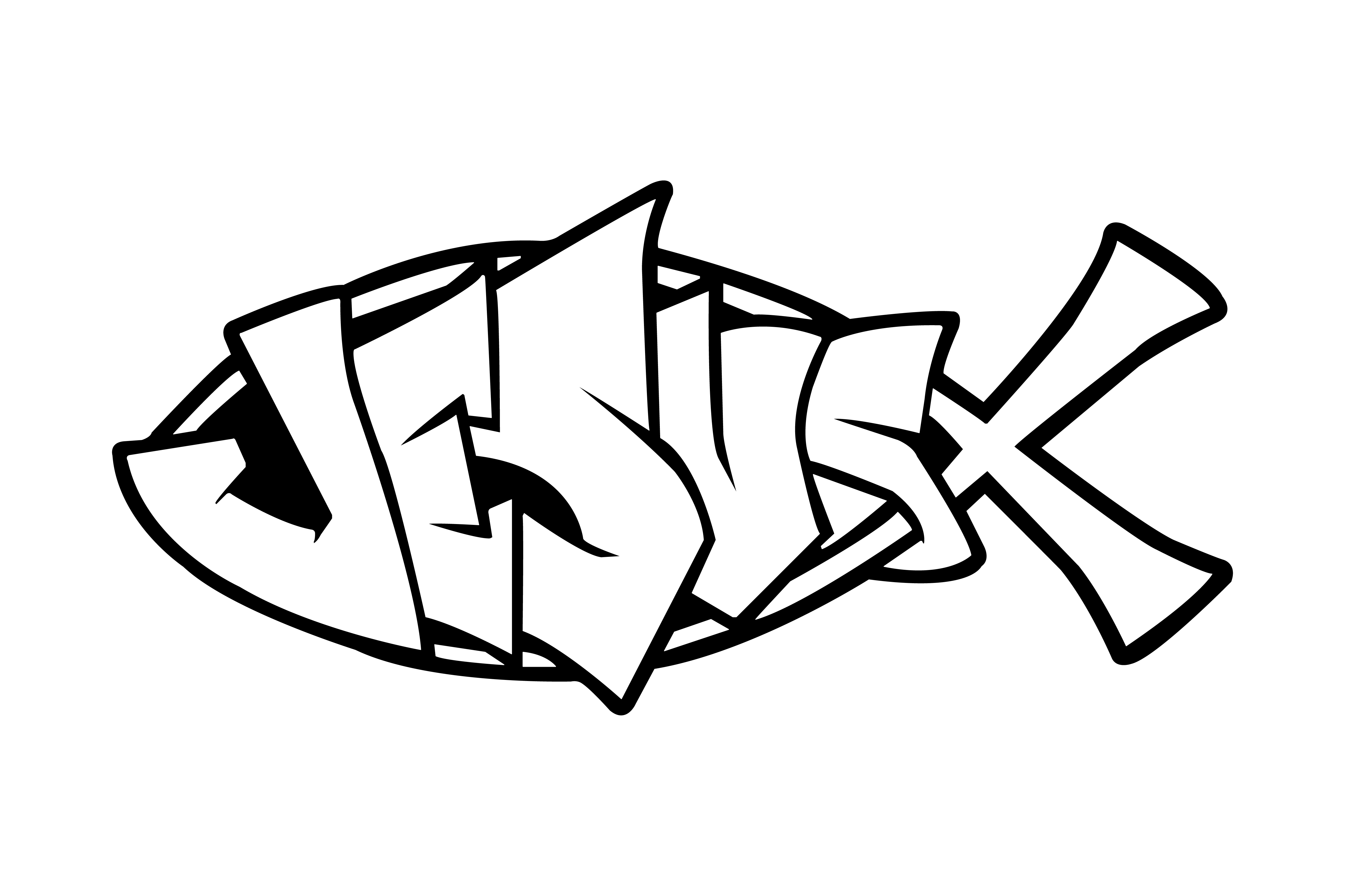
Jesus (Fish)
Screen printed in Los Angeles by Heady–Made using black ink (front) on 90s deadstock t-shirts with TAGBANGER demask woven label hand stitched inside. Jesus (Fish) was found on the back of a weather-beaten 2003 Cadillac Escalade parked near the Hollywood Reservoir, and is part of an ongoing series of vernacular graphics documented while walking and taking public transportion throughout the city of Los Angeles.
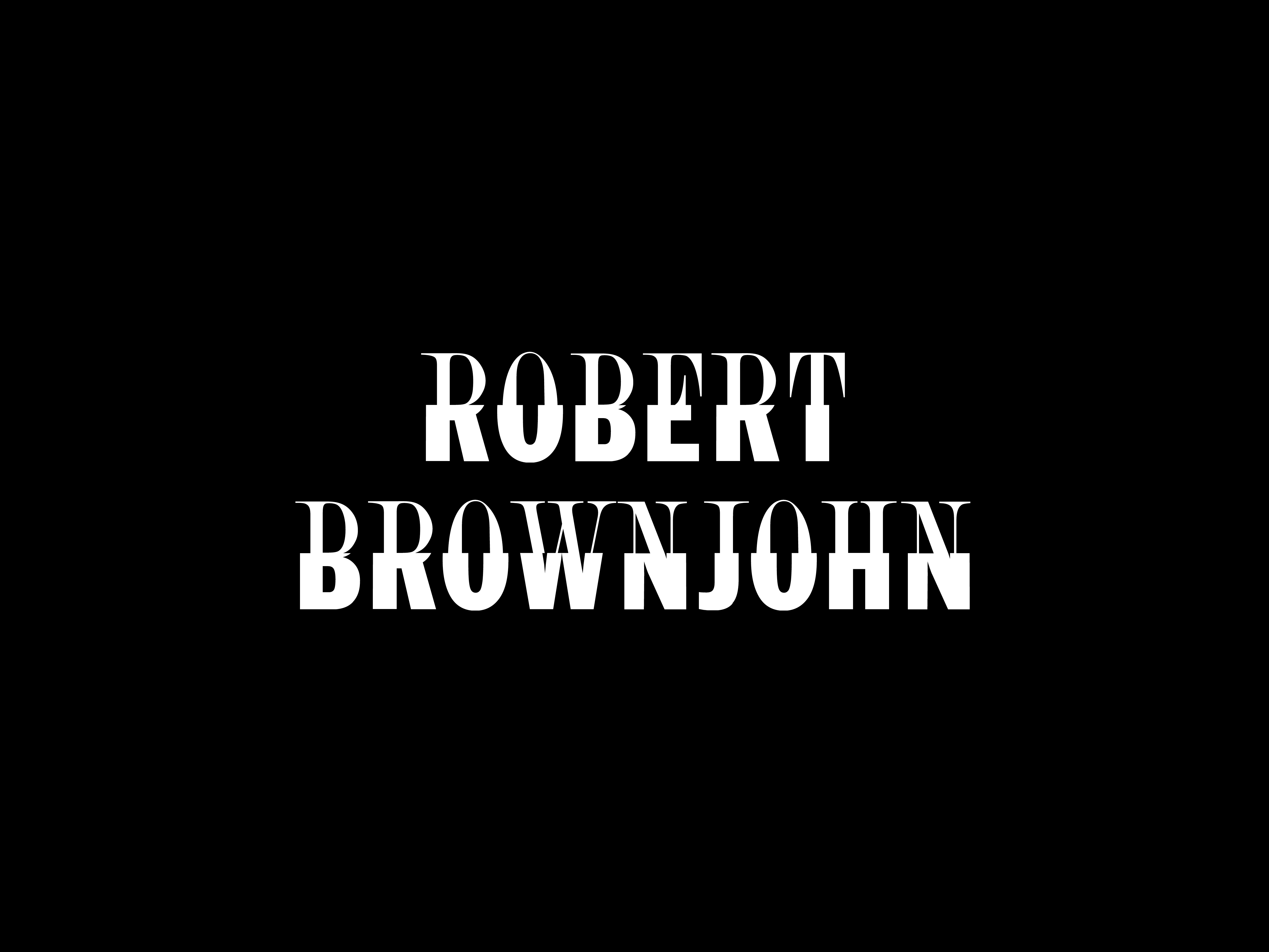
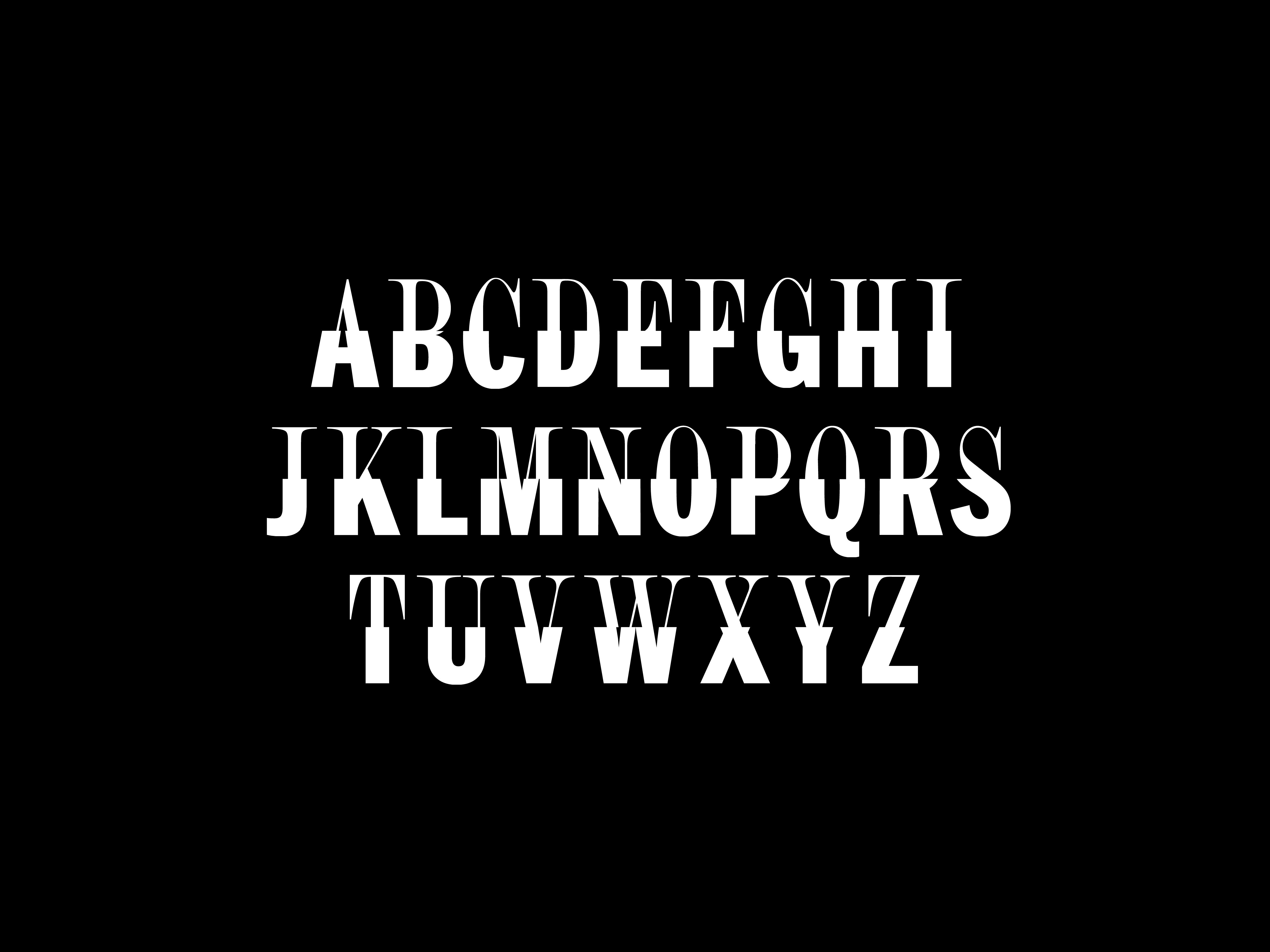
Robert Brownjohn
Design of Robert Brownjohn, an open-source typeface based on the 1959 Grishman-Ryce Duo cover art designed by Robert Brownjohn. It was created using the Font-Remix tool by Lorraine Li that proposes modes of configuring letterforms in browser using opentype.js. By performing boolean operations, new fonts are generated at runtime from the vector paths of two existing fonts. Typeface designed by Lorraine Li and Jonathan Maghen. Available at Primary and Library Stack.
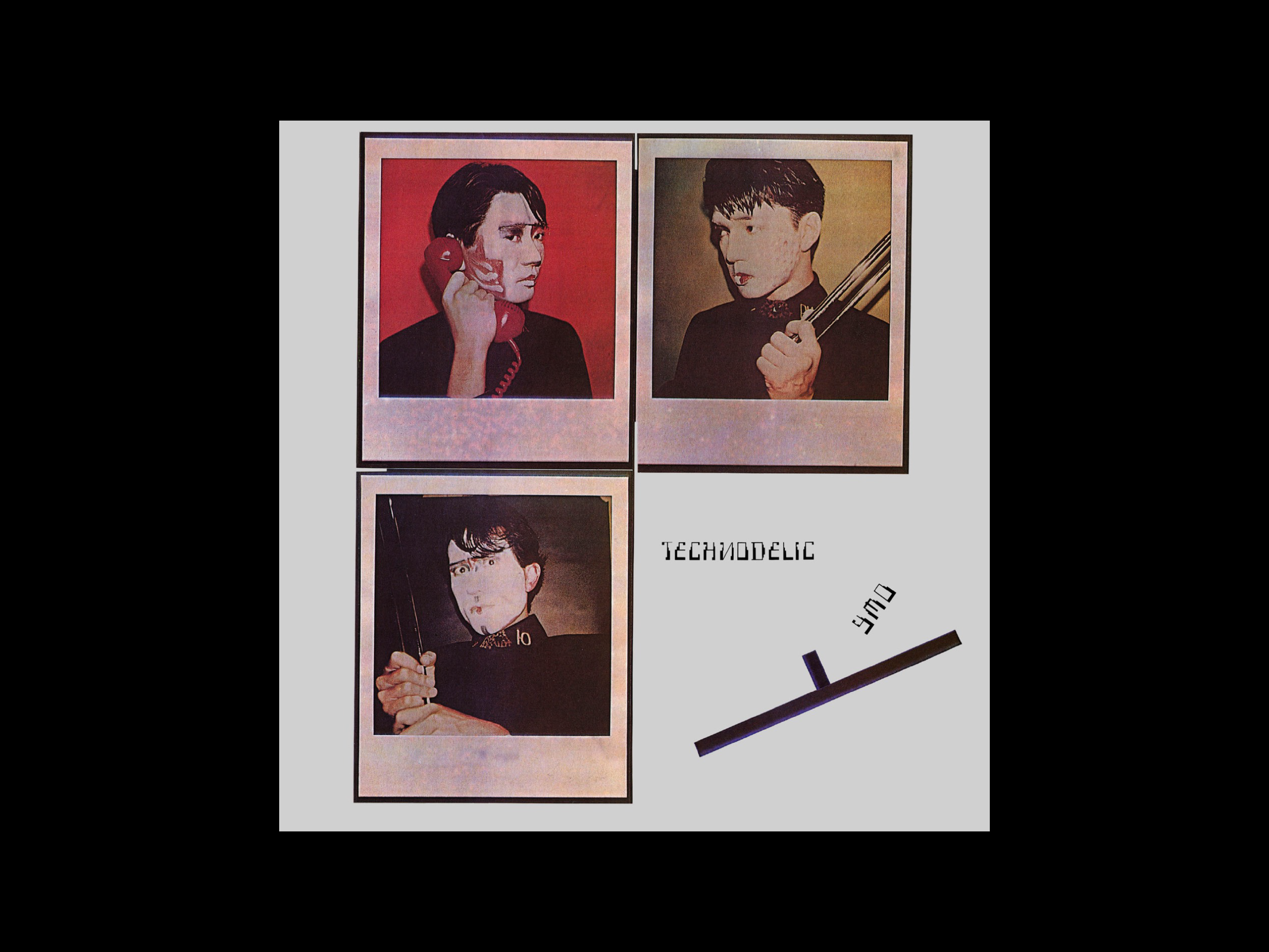
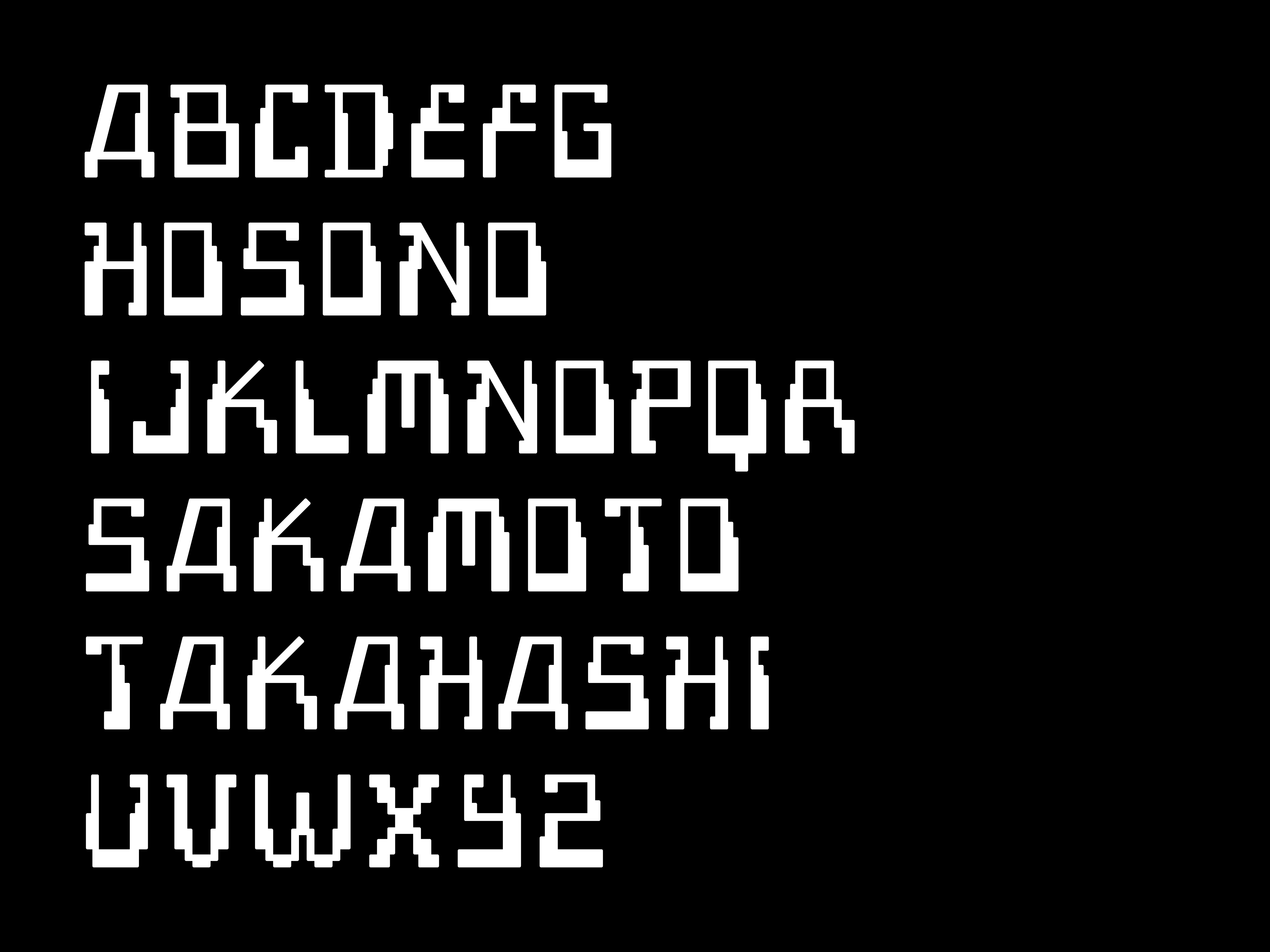
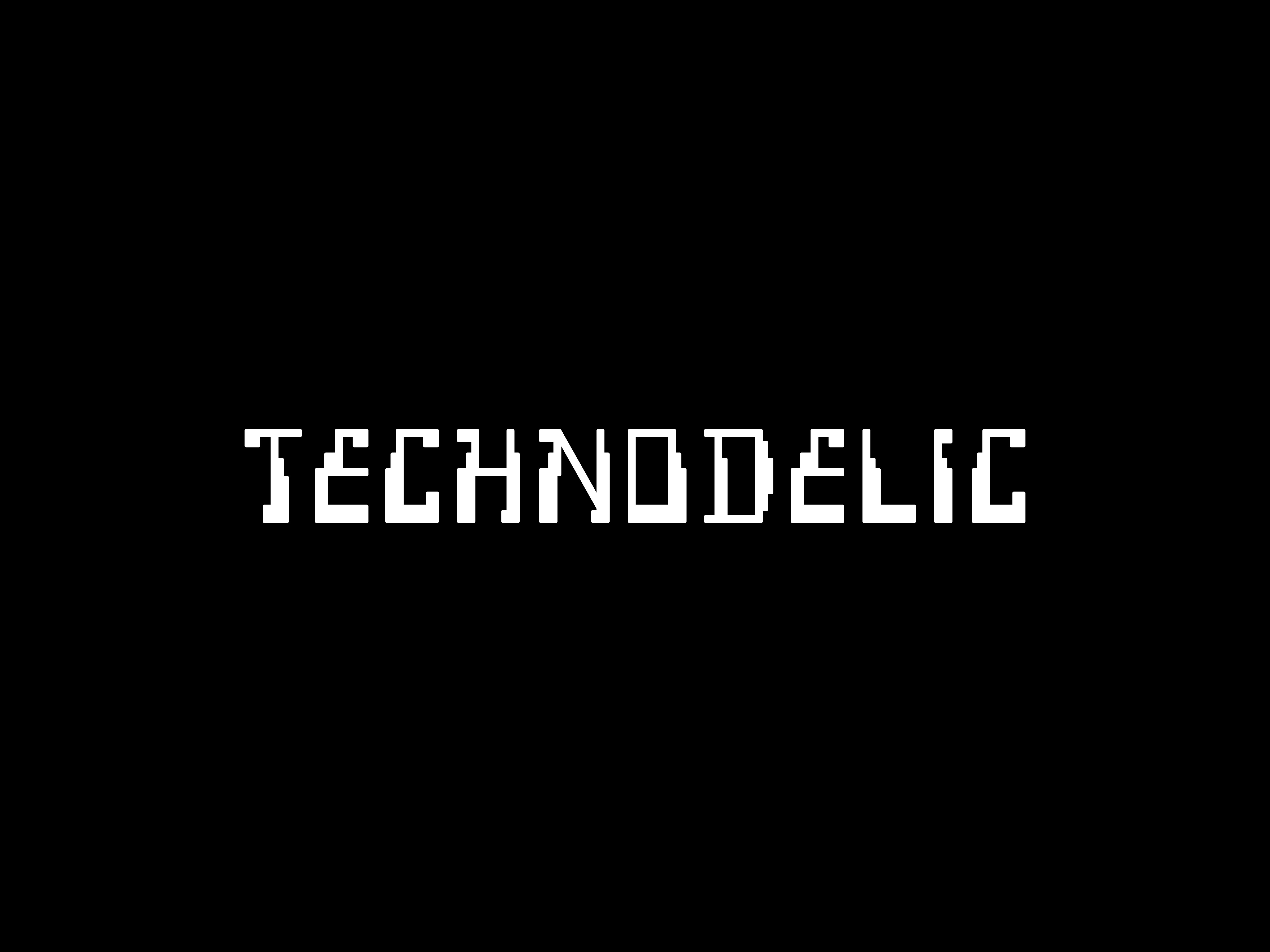
Technodelic
Design of Technodelic, an open-source typeface based on the 1981 YMO album cover art and logo designed by Yukimasa Okumura. The limited A–Z character set serves as a foundation for future iterations while also maintaining reverence for the original, which does not include lowercase, figures, or punctuation. Technodelic is the first SIL Open Font License typeface released by Primary Foundry and has 52 glyphs. Available at Primary and Library Stack.
Denise Scott Brown
NFT inspired by the work of Denise Scott Brown. Although Brown was among the most influential architects of the twentieth century, much of her work was misattributed to her partner, Robert Venturi. Brown initiated the study of Las Vegas, and the vernacular of the Mojave Desert city, along with the town of Tiruvannamalai in India (visited by Ettore Sottsass in the 1960s) both have a direct link to development of the postmodernism movement.
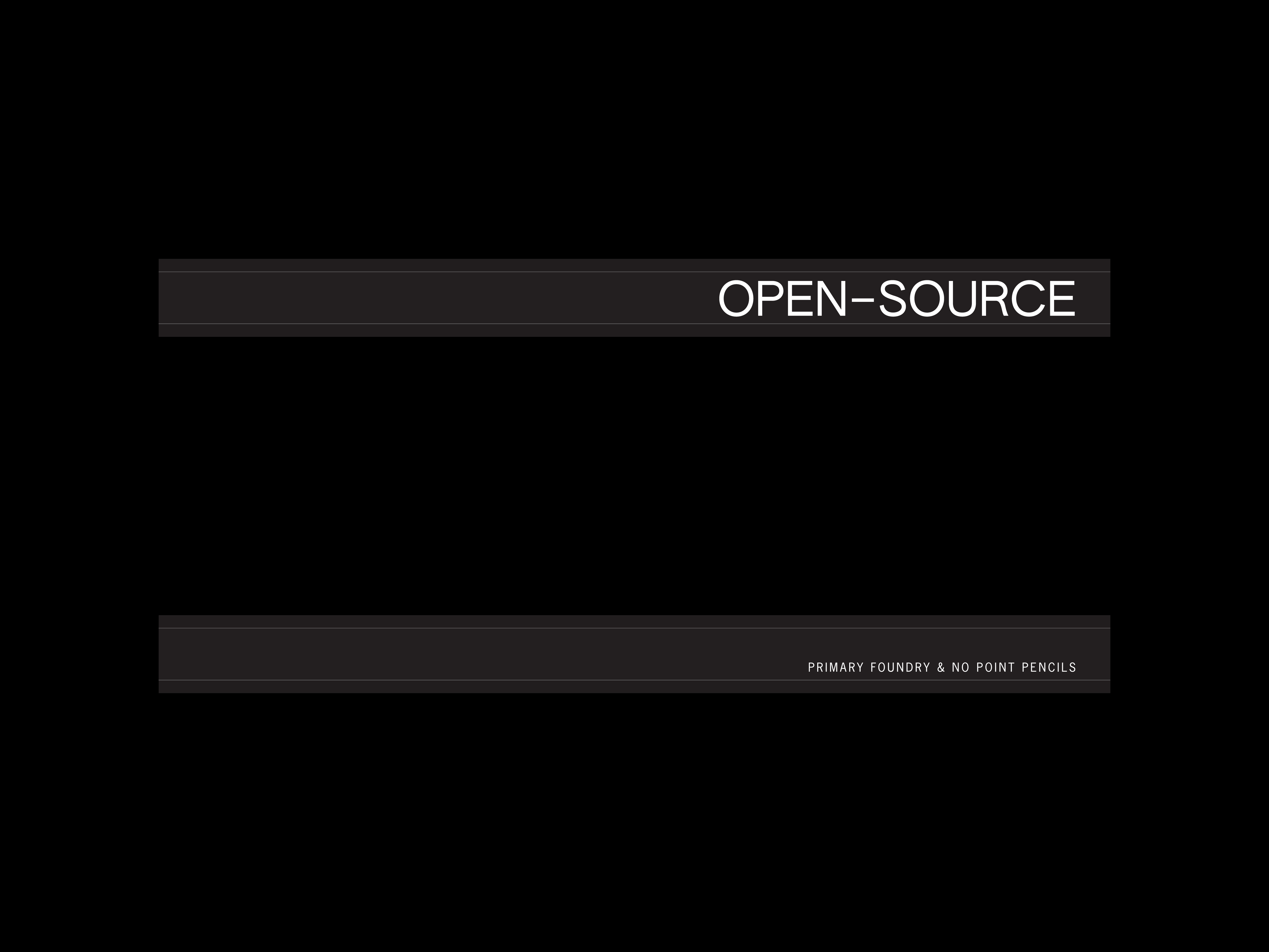
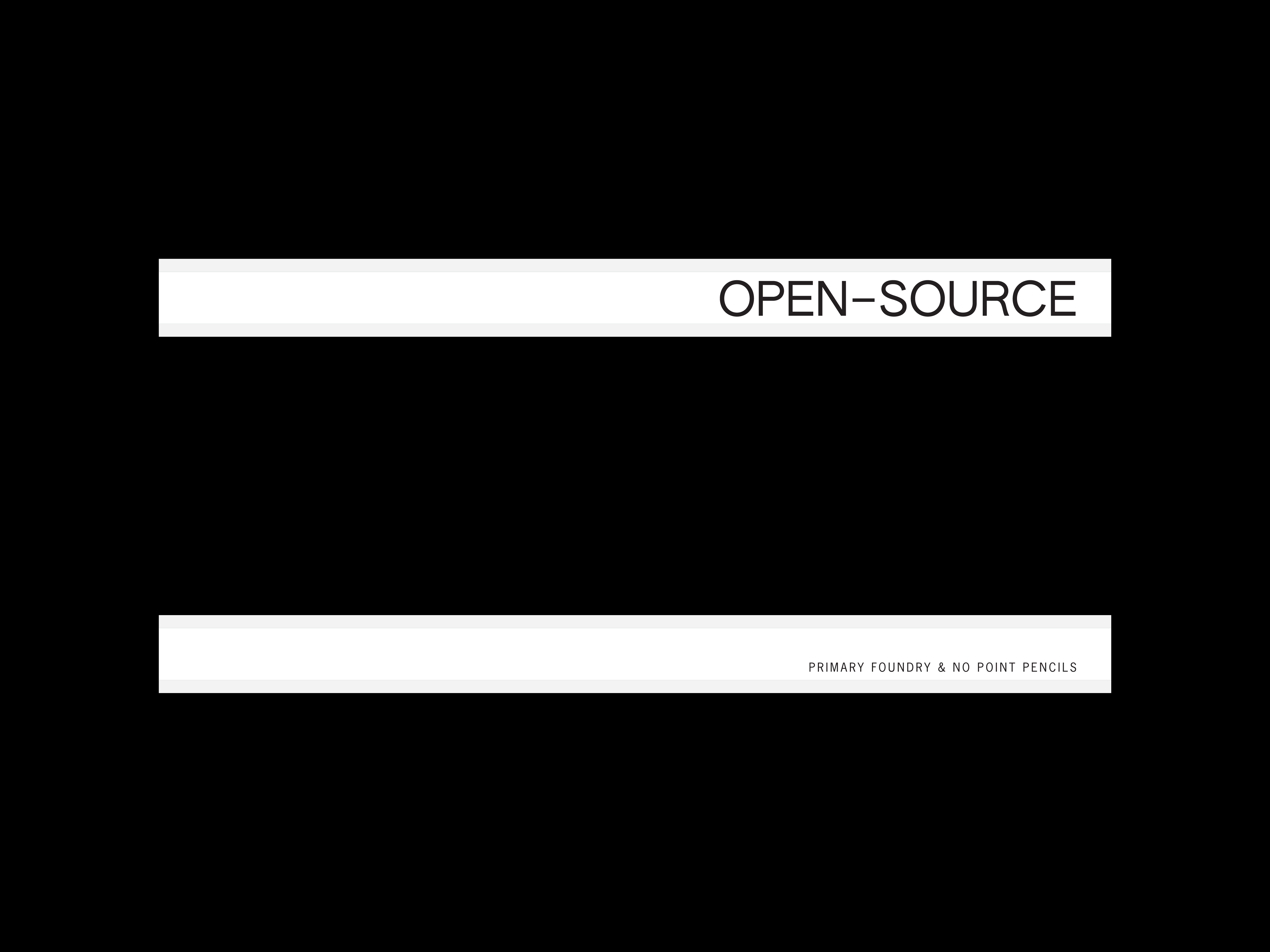
Open–Source
Design and art direction of edition for Primary Foundry. Open–Source is a collaboration between Primary Foundry and No Point Pencils, inspired by the burgeoning open-source software model of 1970s and 1980s. The A side of the object, a Musgrave carpenter pencil, is set in Authentic Sans, designed by Christina Janus and Desmond Wong, which was released by Authentic Business under the SIL Open Font License; the B side is set in News Gothic metal type using the in-house Kingsley Machine of Tom Kracauer and Tiffanie Tran. Made in USA.
Vaquero
NFT based on a weather-beaten decal on an F-150 pickup truck at a salvage yard in Los Angeles, as documented by artist Daniel Paul Schubert. The fragmentation of the decal mirrors both the Mexican diaspora throughout the USA, and the different states in Mexico where nearly countless migrations have begun.
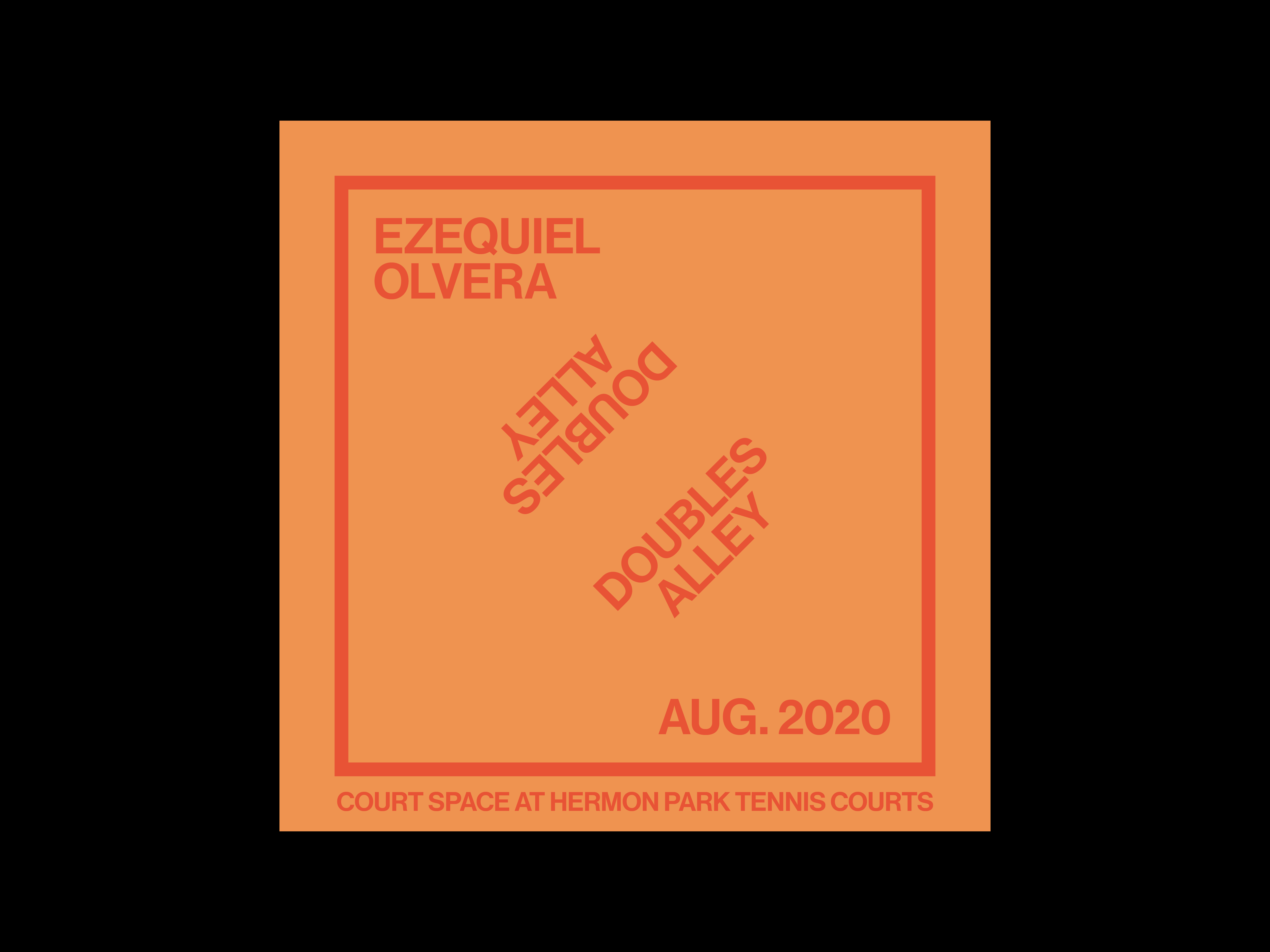
Doubles Alley
Design and art direction of posters for the Ezequiel Olvera Court Space exhibition at Hermon Park in Northeast Los Angeles. The design has been appropriated from the Lawrence Weiner poster, Von Unten Gekippt Von Hinten Bedeckt (Tilted From Below Covered From The Rear), for the 1981 installation at Kabinett für Aktuelle Kunst. The space between the exhibition title, Doubles Alley, is symbolic of the walkway between the actual tennis courts at Hermon Park.
Art Handler
Design and creative direction of logotype for Art Handler. In collaboration with Clynton Lowry, founder of the first and only publication to break down art world myths, created the standard logo, which is inspired by the Palfinger hydraulic liftgate company identity. The logo will be printed and embroidered on various apparel and objects, including quilted work jackets, as part of a series of editions by Art Handler.
Night Court
Design and creative direction of Night Court embroidered cap. Typeset in TR Mono (unreleased) by Berton Hasebe, and embroidered by Platinum Stitches in Altadena on garment washed cotton chino twill cap, in an edition of 24, for the Court Space installation at Art Los Angeles Contemporary (ALAC) with Gozié Ojini — curated by Ezequiel Olvera.
Schriftsystem
Design of Schriftsystem, a fixed-width typeface based on the analog writing system (1887) of Friedrich Soennecken, and the Metafont Program (1979) of Donald Knuth. Schriftsystem has 184 glyphs with basic Latin characters, lining figures, old style figures, ligatures, punctuation, symbols, and extensive alternates. License includes 3 styles: Stencil, Stencil Round, and Stencil Pill. Available at Primary.
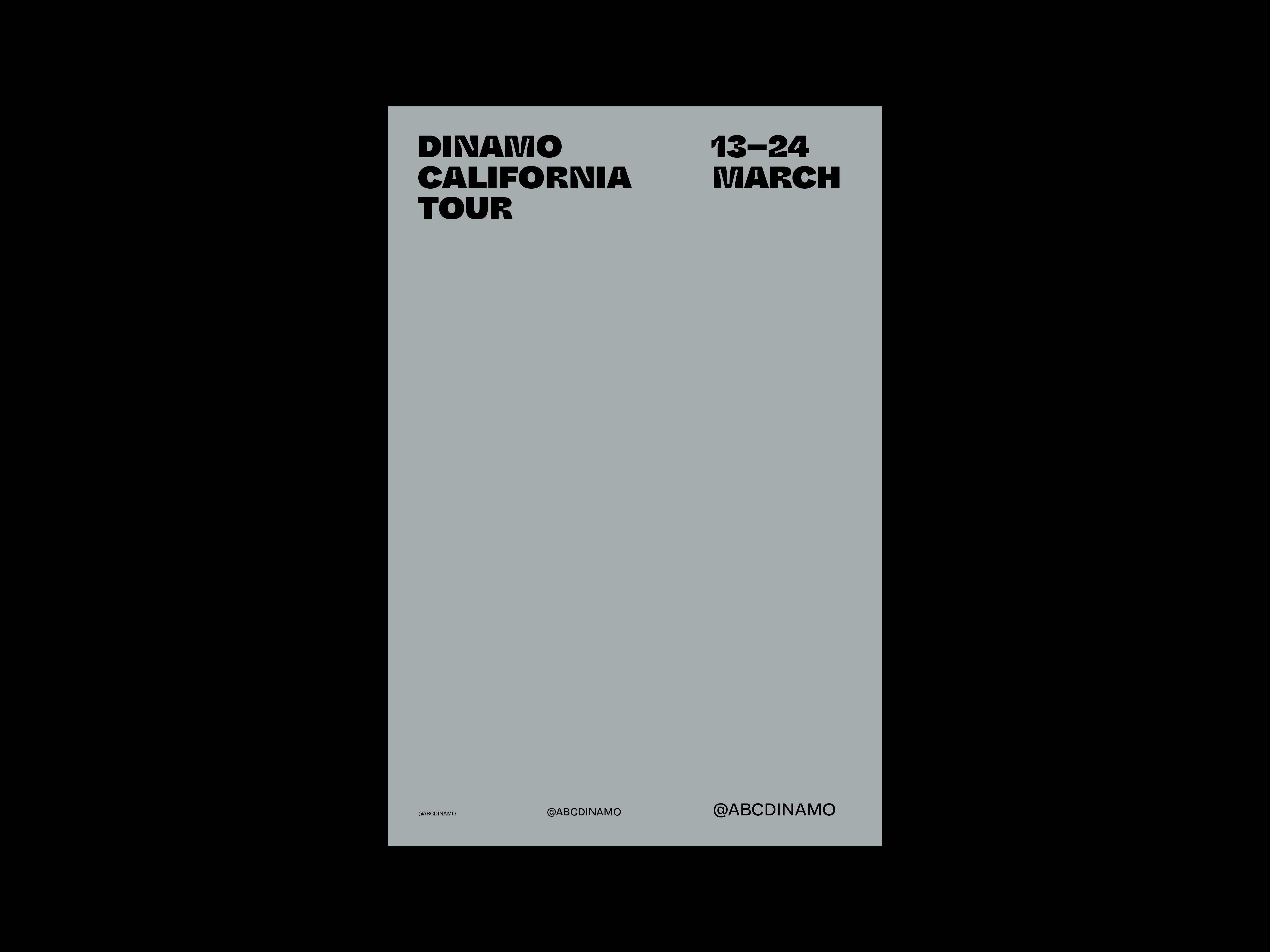
Dinamo California Tour
Design and art direction of California tour posters, typeset in Whyte Regular and Super Inktrap. In collaboration with Dinamo, organized a California tour from San Francisco to Los Angeles that included presentations at CCA, CalArts and ArtCenter, and a two-day workshop at Southland Institute. Project realized with Johannes Breyer, Fabian Harb, Jon Sueda, David Karwan, Colin Frazer, Stephen Serrato, and Joe Potts.
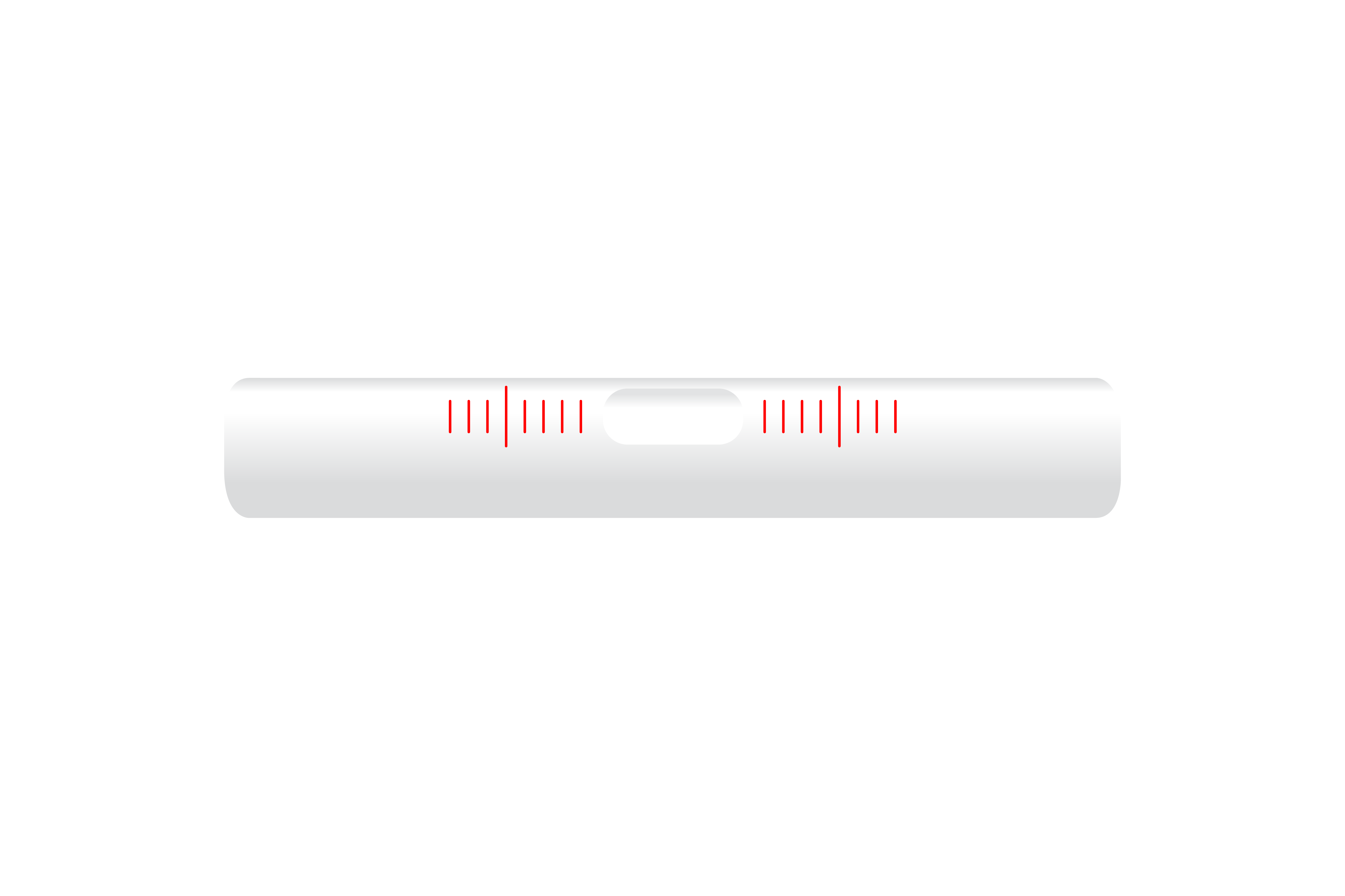
Precision Level
Design and art direction of a proposal, Precision Level, for Art Handler. The project came out of an interest in the language of ‘privilege,’ a misnomer, and how to address double standards on the basis of economics (classism) and ancestry (racism) through use of critical thinking to work towards equality. The precision level, used primarily in laboratory settings, was chosen to symbolize this work. Initiated in March 2019, more than a year before global protests in May 2020, the (rejected) proposal foresees the coming unrest because of unresolved historic inequalities in our culture.
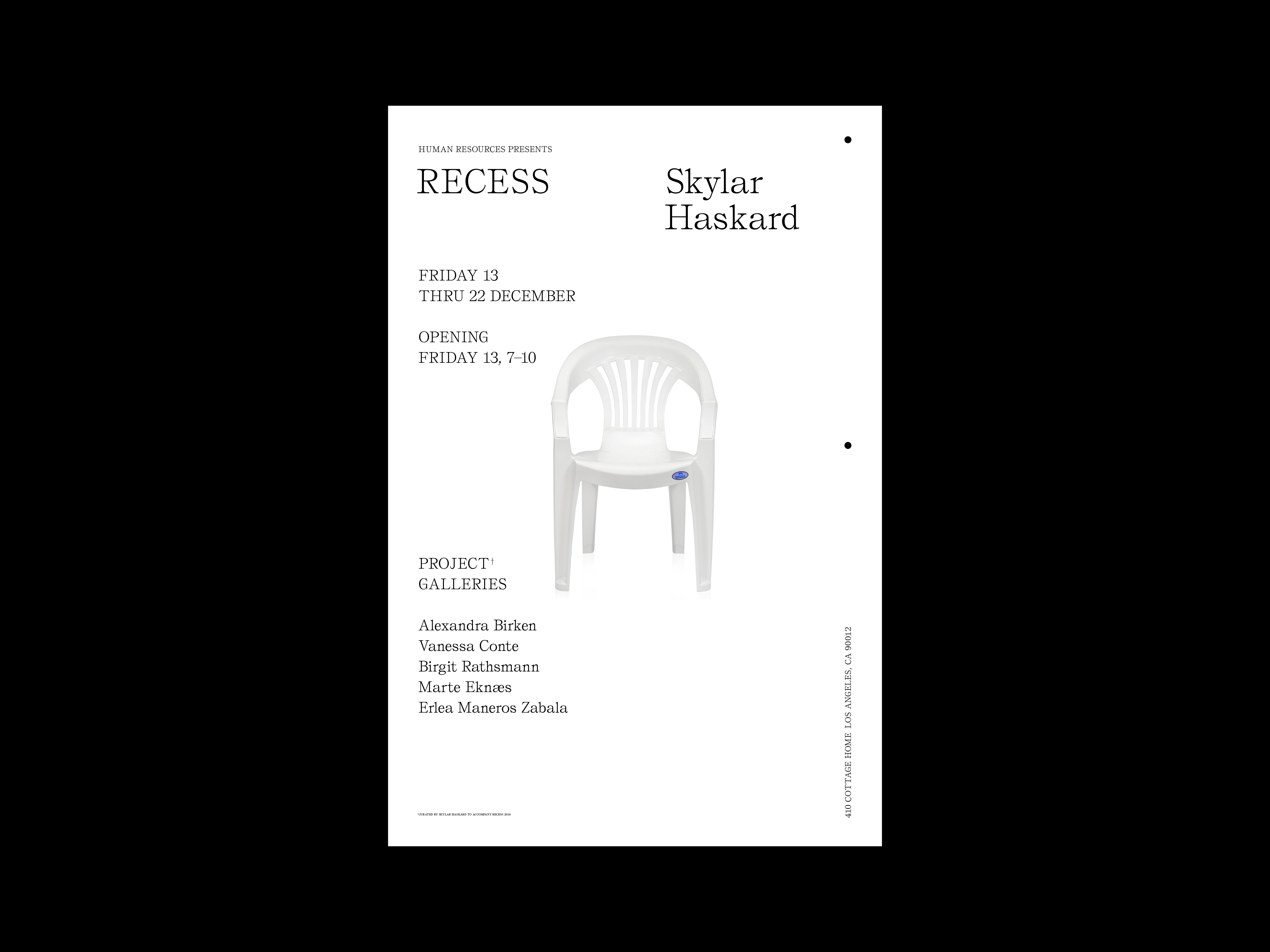
Recess
Design and art direction of posters for Skylar Haskard exhibition at Human Resources. In addition to the solo exhibition, Recess 2019, Haskard curated a group exhibition in the project galleries with: Sara Clendening, Vanessa Conte, Marte Eknæs, Birgit Rathsmann, and Erlea Maneros Zabala.
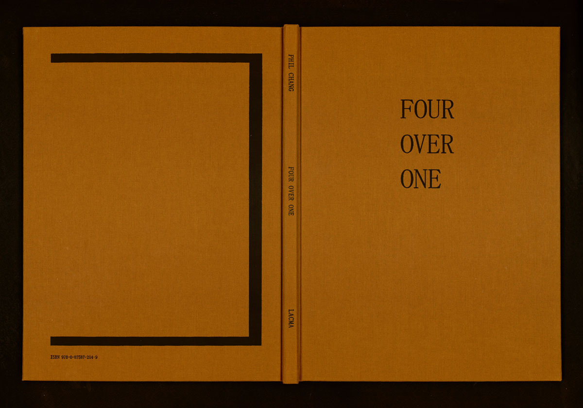
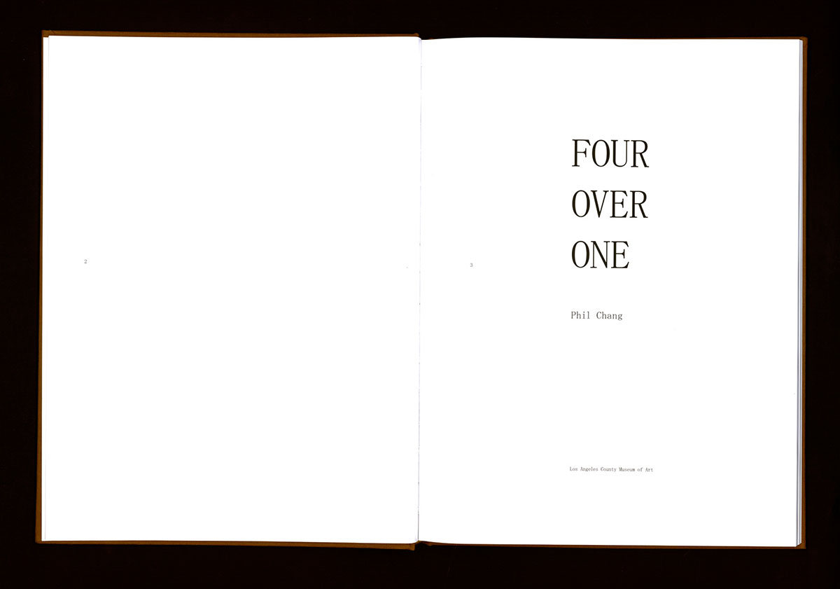
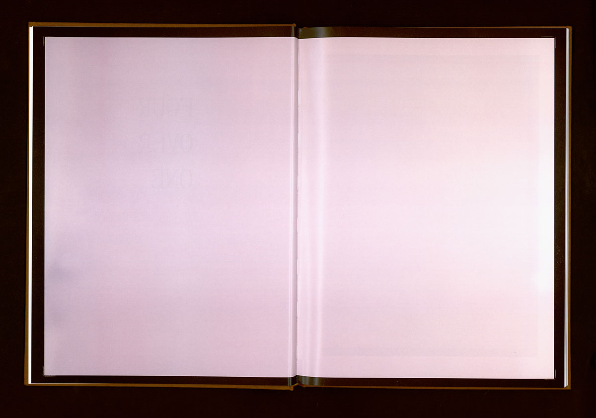
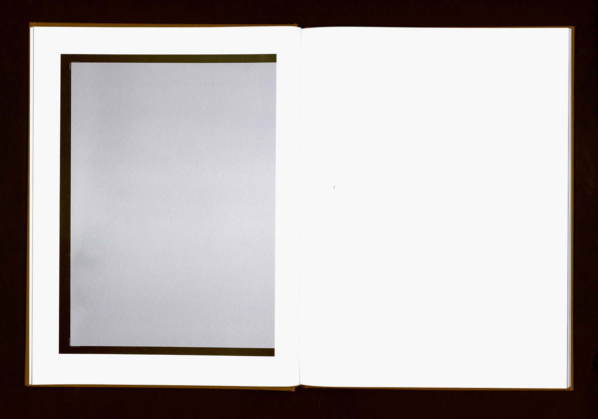
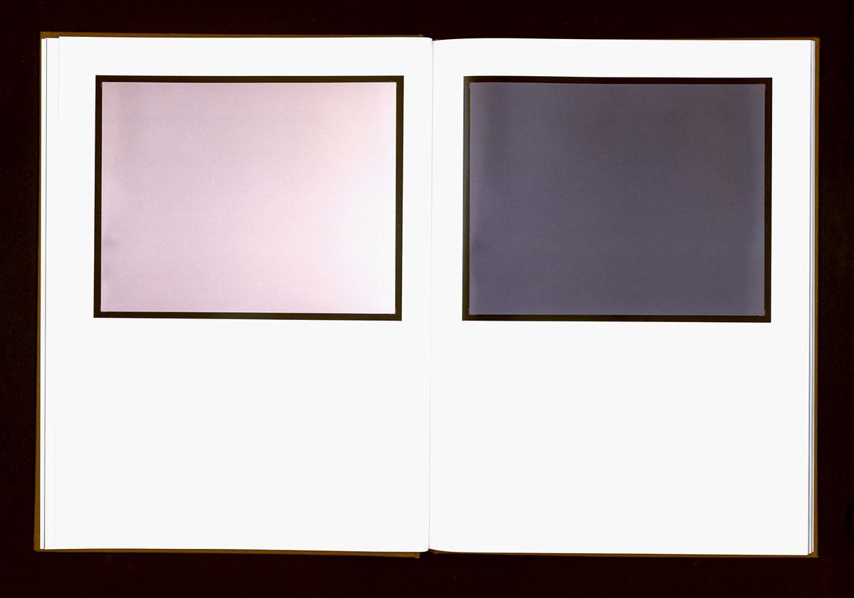
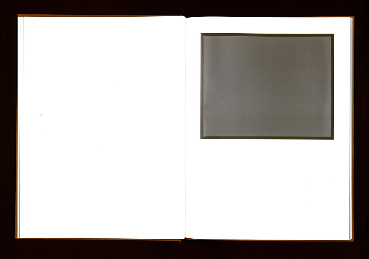
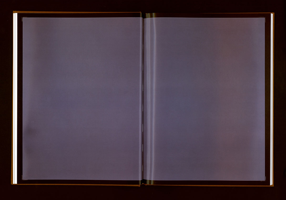
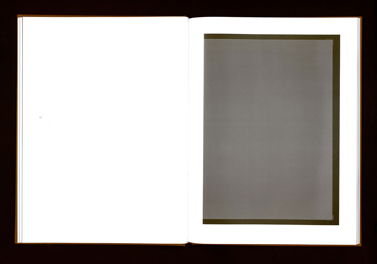
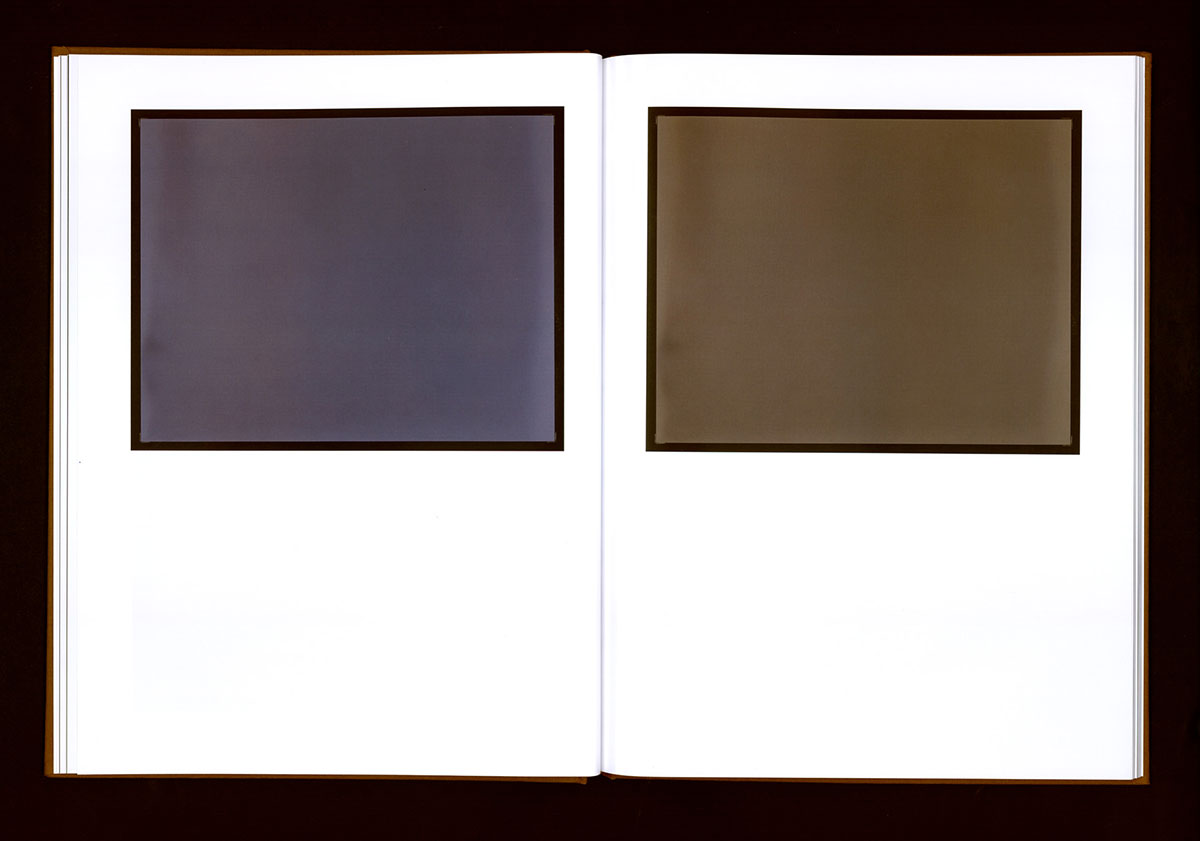
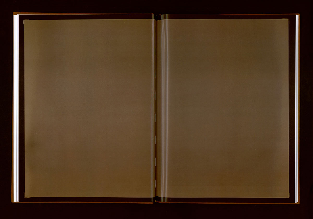
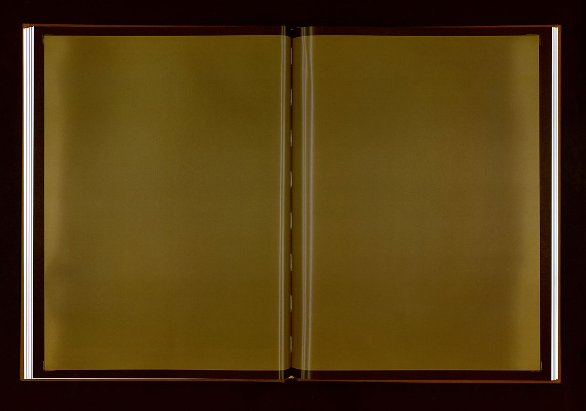

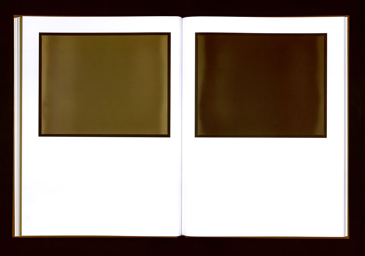
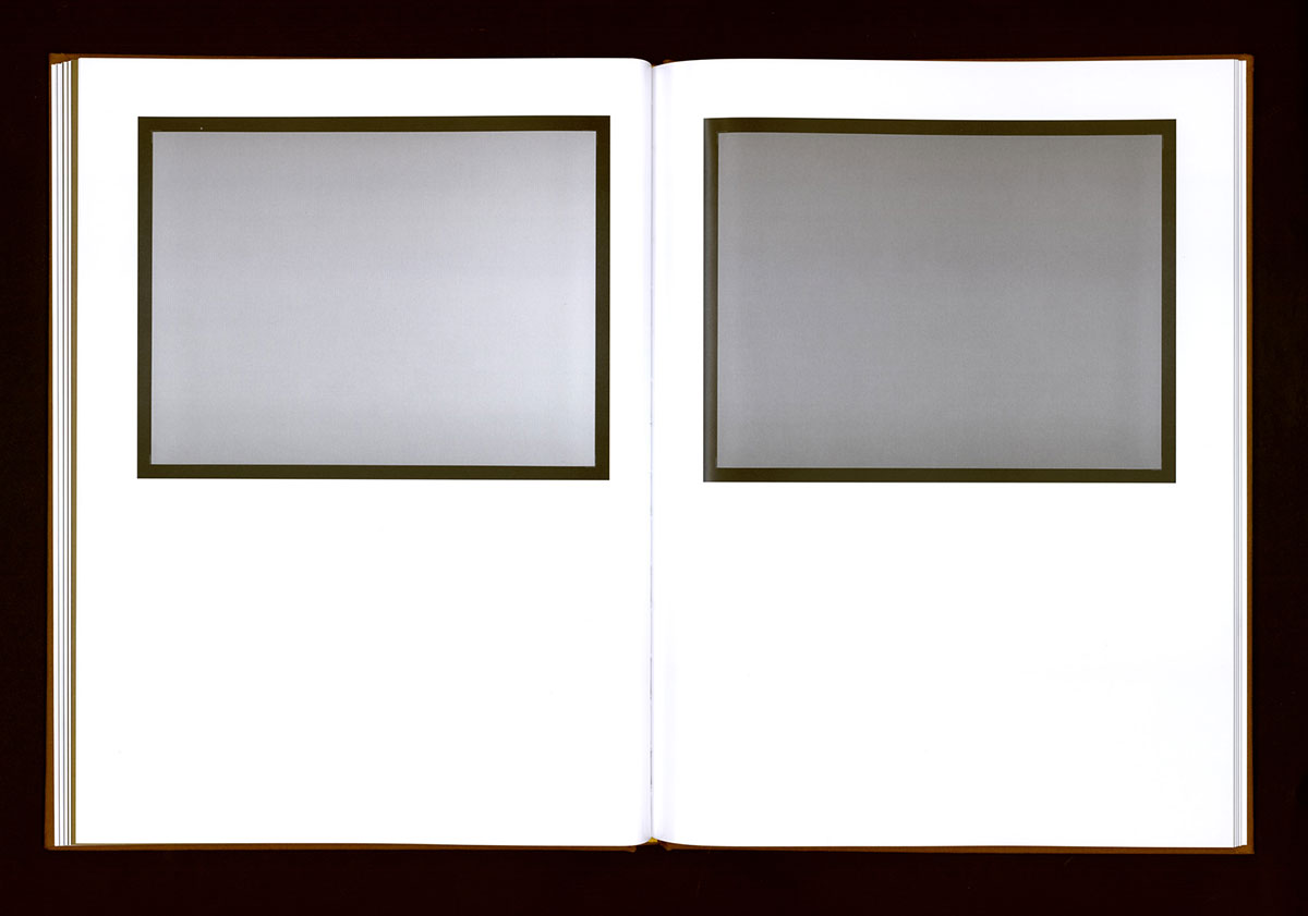
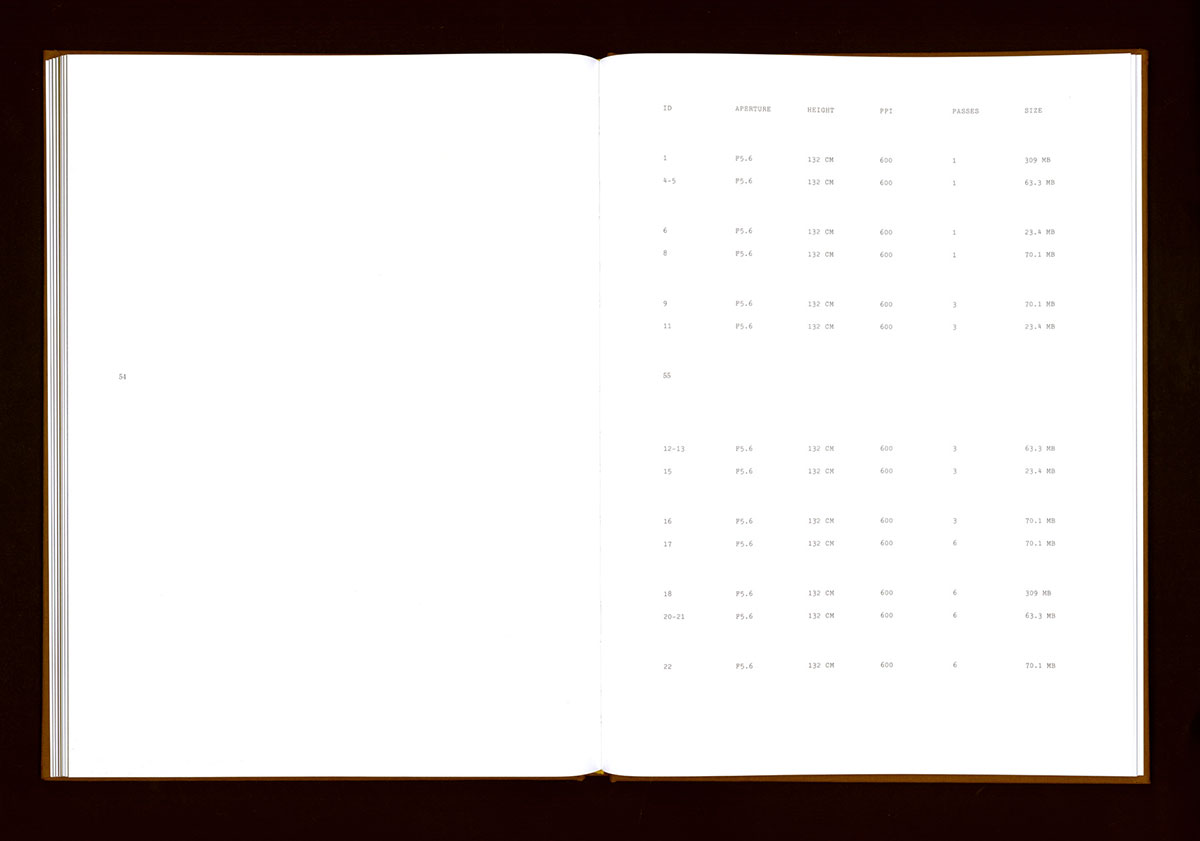
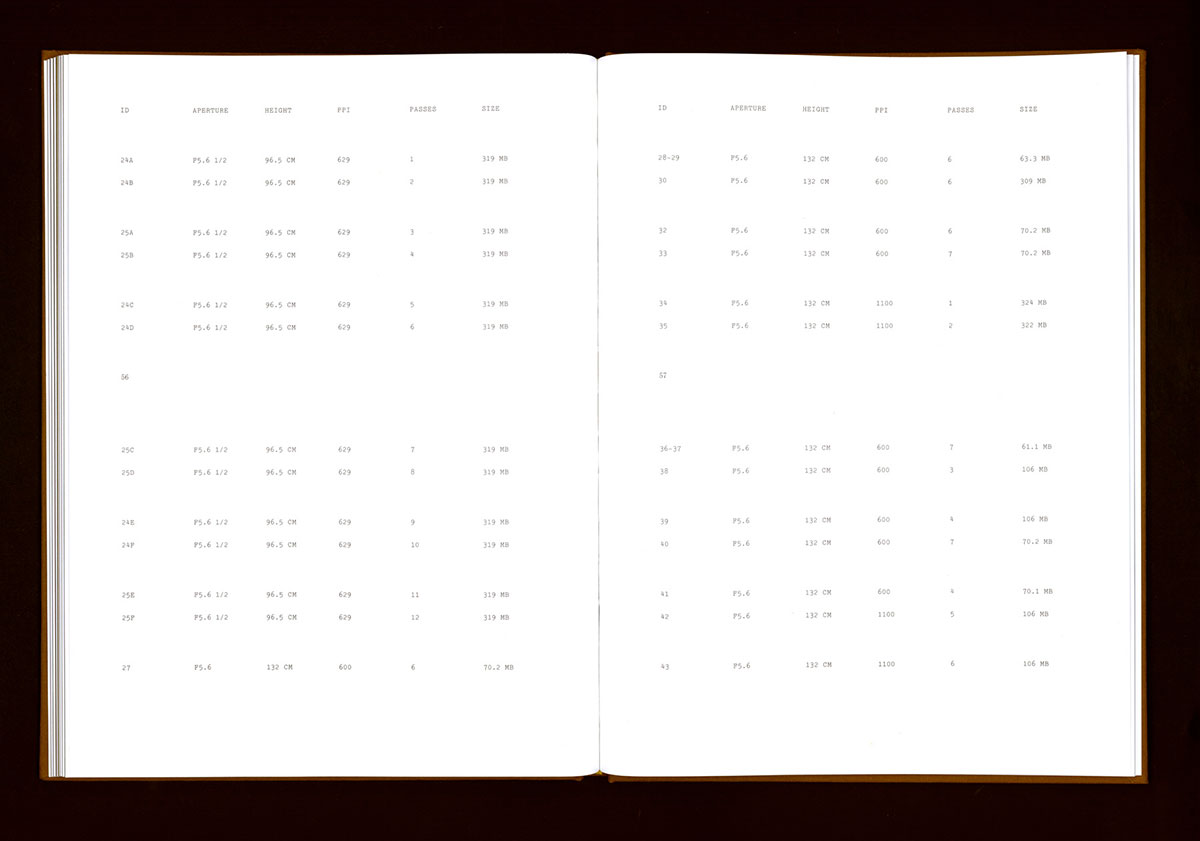
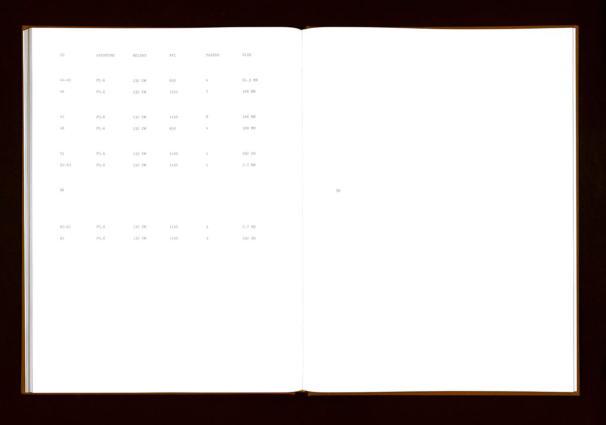
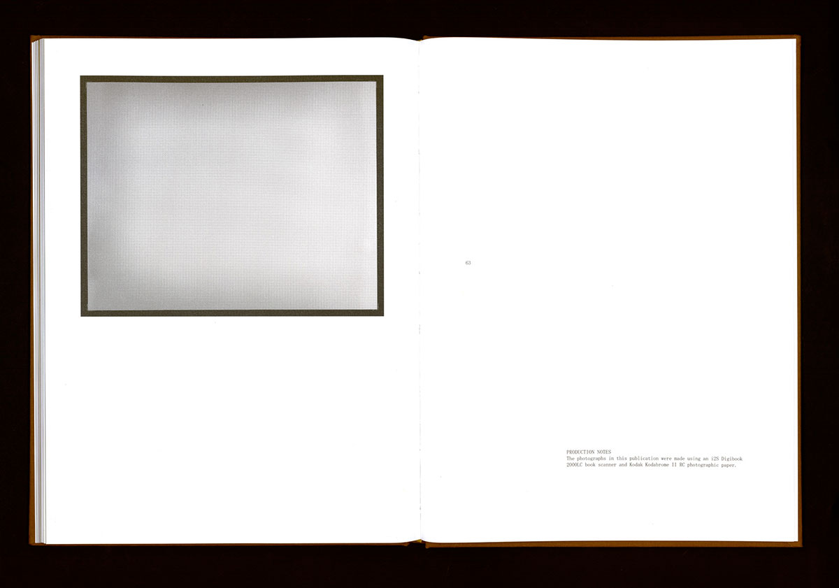
Four Over One
In collaboration with designer Jonathan Maghen, Four Over One is structured around artist Phil Chang’s interest in how new outcomes arise from tension between perceived and actual forms of value. The photographs that appear in the book were created using expired photographic materials exposed by an archival book scanner. Published by the Los Angeles County Museum of Art.
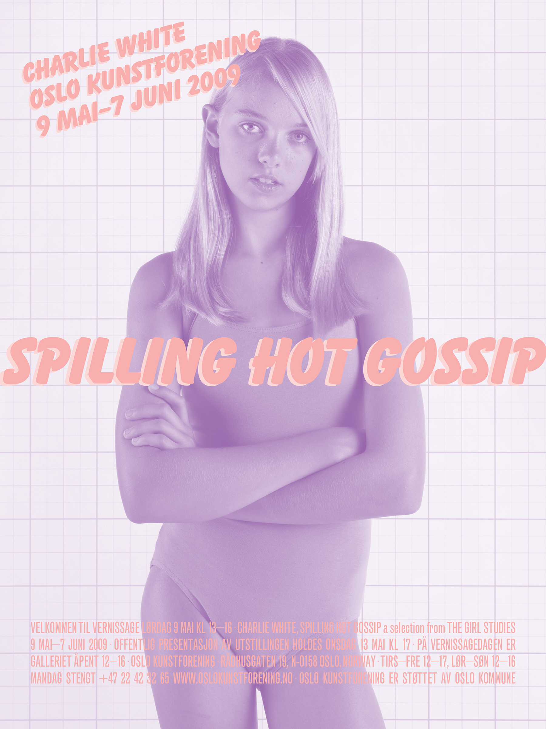
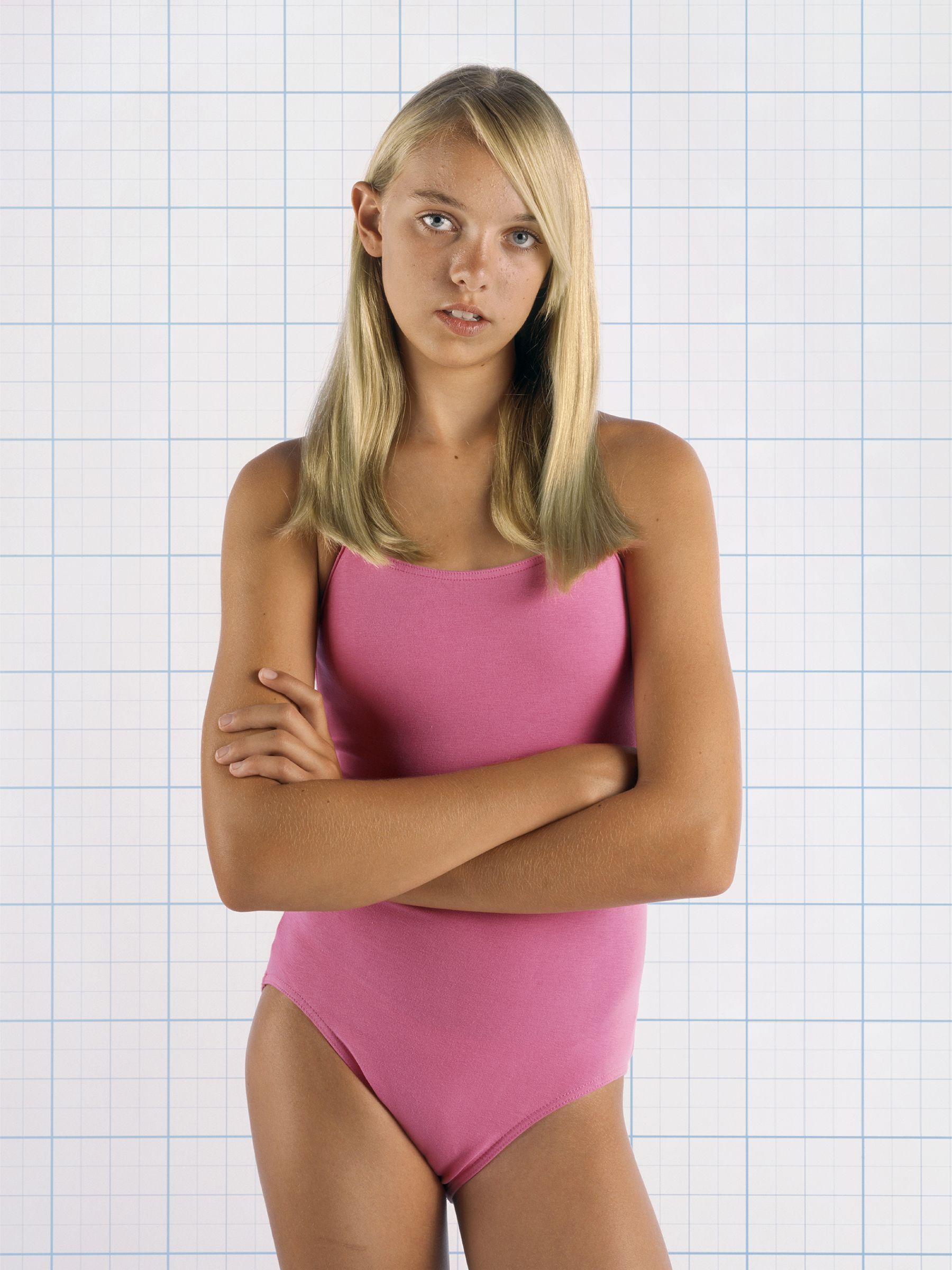
Spilling Hot Gossip
Collaboration with Charlie White and design of poster and signed takeaway for the exhibition Spilling Hot Gossip at Oslo Kunstforening. Spilling Hot Gossip continued the exhibition of works from the Girl Studies Series, including the film American Minor, and cartoon OMG BFF LOL. White signed SHG posters at Printed Matter, Inc.